Amazon Web Services · December 2025 Concept Proposal · Cost Transparency

Amazon Athena
Usage Companion
Widget

← All work PROJECT PRESENTATION
Role
Sr. UX Designer
Employer
Amazon Web Services
Product
Amazon Athena
Scope
Cost Visibility Widget
Status
Concept Proposal
Phase
Validation
Amazon Athena Usage Companion Widget preview

Project summary

I built a small in-console helper for Amazon Athena that shows estimated query costs in real time so people don't get surprised by bills. It gives instant cost estimates and simple warnings so users can manage spend without leaving the Athena workspace.

Project E2E workflow

01

Customer Feedback Analysis

Analyzed Athena user feedback using AWS Aperture AI tool to surface patterns in July–August 2025 data.

02

Problem Definition

Identified real-time cost visibility gaps, Free Tier tracking issues, and competitive risk.

03

Persona Research

Defined primary user persona and mapped daily frustrations around cost unpredictability.

04

Solution Ideation

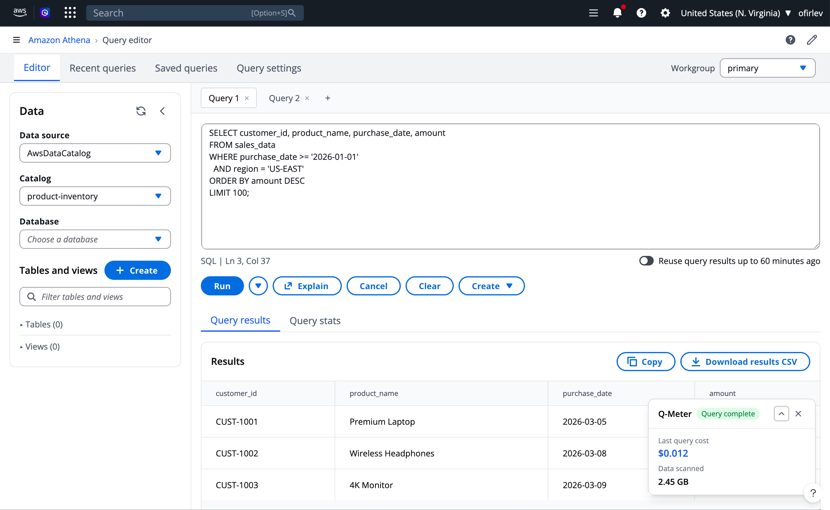
Conceptualized Q-Meter, a persistent in-console usage companion with real-time cost tracking.

05

User Workflow Mapping

Defined interaction scenarios and user decision flows for cost-aware query execution.

06

Design Approach

Established visual framework, component principles, and UX guidelines for the widget.

07

Wireframing

Created low-fidelity layout explorations to validate information hierarchy and placement.

08

High-Fidelity Mockups

Produced final mockups using an AI-assisted design workflow and validated with stakeholders.

01 — Context

Real-time cost visibility for serverless queries

Amazon Athena is a serverless query service for analyzing data in Amazon S3 using standard SQL. While the pay-per-query pricing model ($5/TB scanned) offers flexibility, it creates a critical challenge: users have no real-time visibility into query costs while working in the console.

After analyzing customer feedback through Aperture (AWS's AI-powered feedback analytics tool) from July-August 2025, a clear pattern emerged: Athena users struggle to track and predict their query costs during execution, leading to unexpected charges and difficulty managing Free Tier limits.

“No tracking of query costs during execution. Missing feedback loop on resource consumption.”

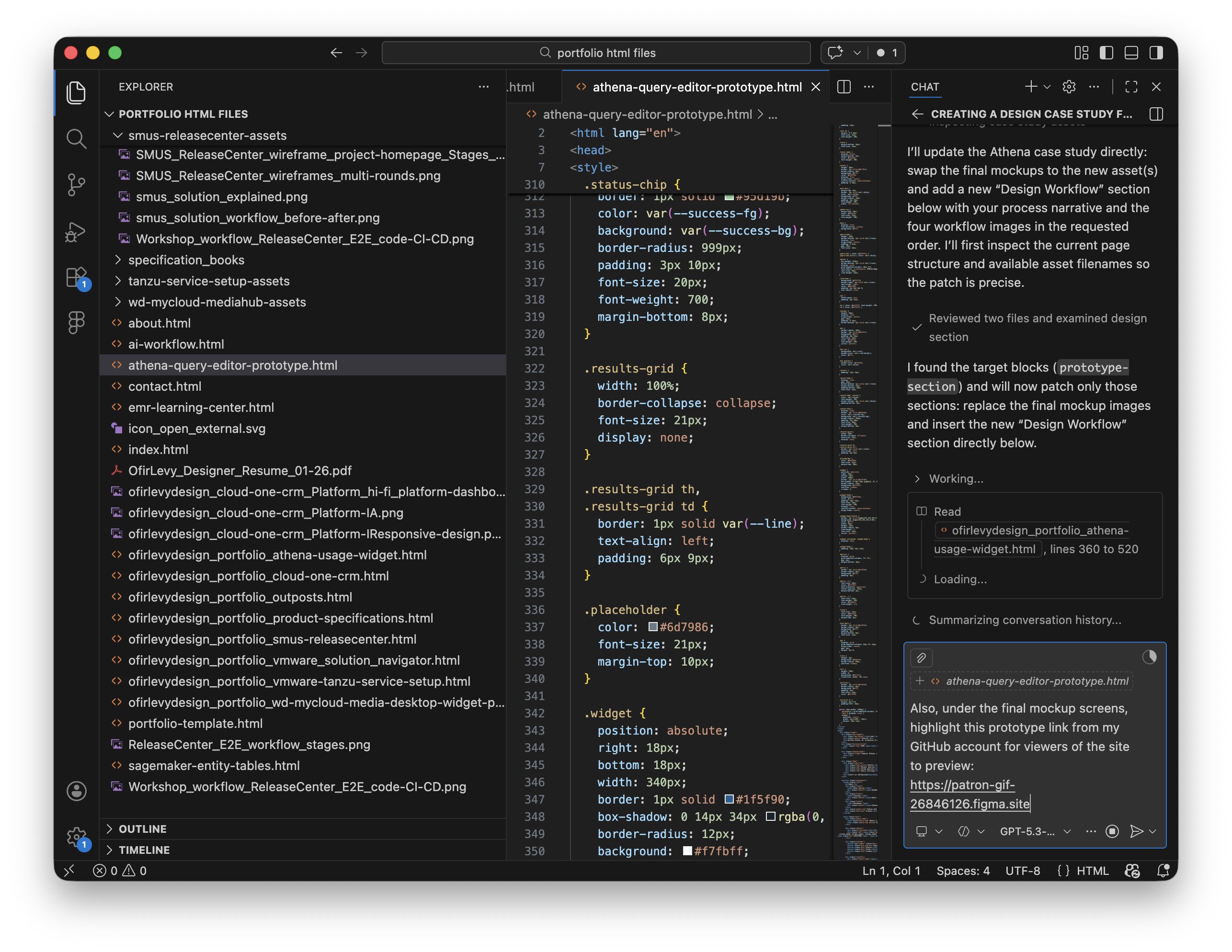
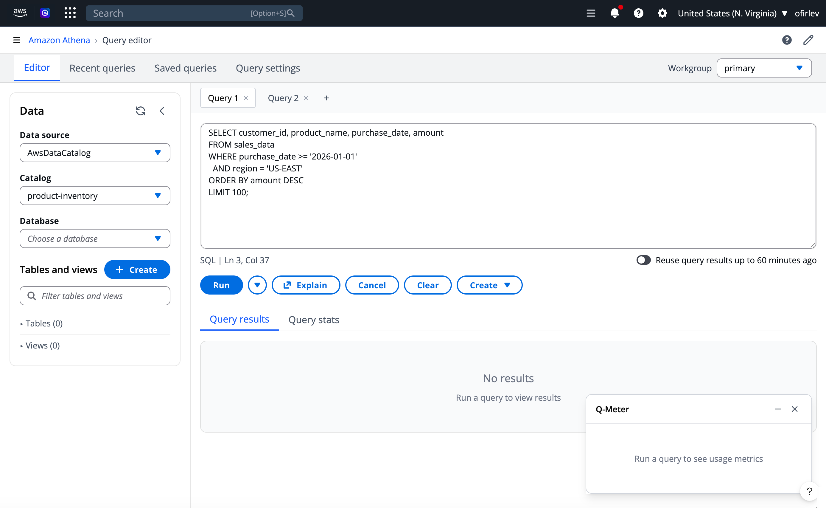
This proposal introduces Q-Meter (working name: Query Buddy) — a persistent usage companion widget that lives within the Athena workspace, providing real-time cost insights exactly where users need them most.

02 — Problem

Cost uncertainty creates friction and risk

Athena's unique position as a serverless query service makes cost transparency particularly crucial. Customer feedback and research insights from multiple sources revealed how these challenges affect daily operations:

Critical Gap

Real-time visibility

No tracking of query costs during execution. Missing feedback loop on resource consumption. Uncertainty around billing impact. Limited ability to forecast costs.

Customer Pain

Free Tier management

Poor boundary visibility for 1TB monthly limit. Difficulty tracking remaining allowances. No approaching-limit indicators. Lack of proactive notifications.

Competitive Risk

Market positioning

Snowflake's superior cost transparency. Better usage monitoring in competing platforms. Risk of customer churn due to pricing opacity.

03 — Primary Persona

Meet Alex, the data analyst managing startup costs

Through research and customer interactions, a primary persona emerged who represents the core user affected by Athena's cost transparency gap.

👤

Alex

Sr. Data Analyst · AI Startup
Experience
1 year AWS
15-person company
Responsibility
Managing startup's AWS budget
Reports costs to CTO
Daily Context
Ad-hoc queries for insights
Optimizes queries off-hours

Alex's frustrations

Can't predict query costs beforehand. Discovers charges only after execution. Limited visibility into optimization impacts. Maintains manual query cost logs. Time-consuming optimization research. Uncertain Free Tier transition timing.

04 — Solution Proposal

Q-Meter: A persistent usage companion

The proposed solution addresses both immediate cost visibility needs and longer-term usage optimization opportunities. A dynamic, context-aware widget that integrates directly into the Athena Query Editor, providing real-time cost tracking, usage monitoring, proactive notifications, and AI-powered optimization suggestions.

📊
Real-time metrics
Query cost estimates, data scan volumes, resource utilization, and budget tracking displayed during query execution
🔔
Proactive alerts
Usage thresholds, budget limits, Free Tier boundaries, and cost anomaly detection with actionable notifications
🤖
AI optimization
Smart monitoring of usage patterns, cost trends, performance insights, and automated query optimization recommendations
👥
Team visibility
Workgroup-level controls, department cost tracking, shared analytics, and budget management for enterprise teams

Two distinct paths: first-time vs. returning users

These workflows account for the unique challenges of AWS account creation and the transition from Free Tier to paid usage, designed around the principle that the companion should be "mostly advisory, defensive and noninvasive" while providing immediate relevant feedback.

First-Time User Workflow Phase 1-2: Discovery & First Console Experience
First-time workflow Phase 1-2: AWS account setup through first Athena console experience showing Q-Meter widget appearance with Free Tier tracking
Phase 1 (Days 1-2): User creates AWS account, receives Free Tier welcome email, discovers Athena service. Phase 2 (Day 1): Lands on console, Q-Meter appears showing "Free Tier: 1TB available" with green status and onboarding tooltip.
First-Time User Workflow Phase 3-4: First Query & Learning Optimization
First-time workflow Phase 3-4: First query experience showing pre-execution estimates, real-time progress, post-execution summary, and ongoing learning phase with daily summaries and proactive guidance
Phase 3 (Day 1): Writes first SQL query → Widget expands showing estimated 2.3GB/$0.00 → Executes → Post-execution summary with optimization suggestion and real-time progress bar. Phase 4 (Days 2-30): Daily usage summaries, weekly email reports ("15% Free Tier used this week"), proactive guidance at 50%, 75%, 90% thresholds.
Returning User Workflow Phase 1-2: Daily Monitoring & Investigation
Returning user workflow Phase 1-2: Morning routine showing daily summary ($127.50/$500, 3 workgroups), team usage overview, and mid-morning investigation of Marketing department cost spike with AI-powered optimization recommendation
Phase 1 (Morning): Login → Widget shows daily summary: "$127.50/$500, 3 active workgroups" → Review team usage breakdown (Marketing: 45%). Phase 2 (Mid-morning): Identify cost spike in Marketing (40% increase from last week) → Drill-down shows 15 queries yesterday averaging $8.50/query → AI recommendation: "Convert to Parquet: 60% cost reduction" → Share dashboard with team lead.
Returning User Workflow Phase 3-4: Proactive Management & Strategic Planning
Returning user workflow Phase 3-4: Afternoon proactive management showing budget alert at 80%, automatic query throttling setup, and weekly strategic planning with historical usage charts and seasonal pattern analysis
Phase 3 (Afternoon): Budget alert appears: "Marketing at 80% budget" → Review projected spend ($380 against $300 budget) → Set automatic query throttling at 90% → Schedule optimization workshop → Implement new workgroup policies. Phase 4 (Weekly): Review historical usage charts → Analyze seasonal patterns ("Q4 usage typically 25% higher") → Plan capacity adjustments → Cross-service cost analysis (S3, Glue) → Prepare executive summary.
Workflow Logic Decision Points — Contextual Widget Behavior
Decision points diagram showing how widget adapts based on user type (first-time vs returning), Free Tier availability, query size, budget status, and team usage context
The widget uses contextual decision logic to adapt its display. For first-time users: Free Tier tracking or pay-per-query mode based on account status; small queries encourage activity while large queries trigger AI optimization suggestions. For returning users: budget status determines whether to show trends (under budget), alerts (near limits), or controls (over budget); team usage toggles between individual and team oversight views.
06 — Design Approach

Progressive disclosure meets contextual awareness

The design prioritizes both ease of use and information hierarchy, carefully balancing visibility with workspace efficiency. The widget uses a three-level progressive disclosure model to prevent cognitive overload while ensuring critical information is always accessible.

Design System Widget Interaction Pattern — Three Levels of Disclosure
Widget interaction pattern showing three levels: Level 1 always visible with recent query cost and daily budget, Level 2 click-to-expand with monthly activity breakdown by department, and Level 3 detailed view showing Marketing department analysis with AI optimization opportunities
Progressive disclosure hierarchy: Level 1 (Always visible) shows daily activity, recent query cost ($6.26), daily spend against budget ($127.50/$500), and workgroup count. Level 2 (Click to expand) reveals this month's activity breakdown by department (Marketing 30%, Finance 45%, Operations 25%) with 12% trend vs last month. Level 3 (Detailed view) provides deep analytics for a specific department with AI-powered optimization opportunities.

Key design principles

Minimal interference with primary tasks. Quick access to crucial information. Progressive disclosure of details. Contextual relevance based on user state and query phase. Defensive and noninvasive presence that adapts to workflow context.

From concept sketches to structured wireframe directions

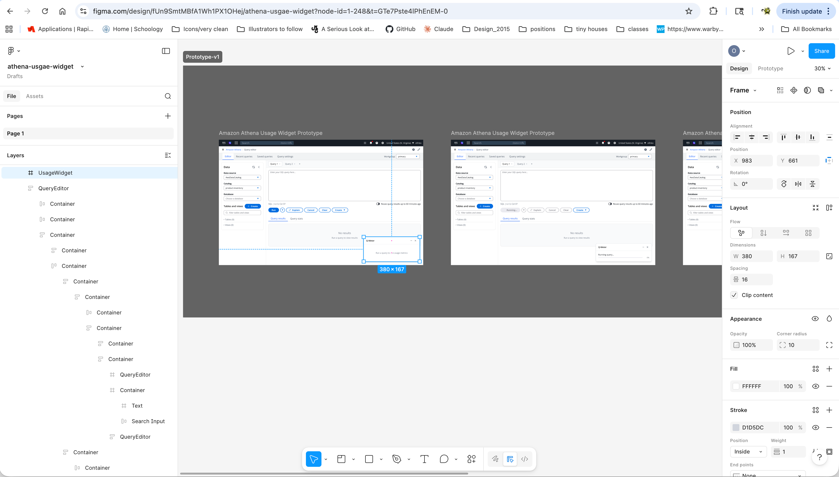
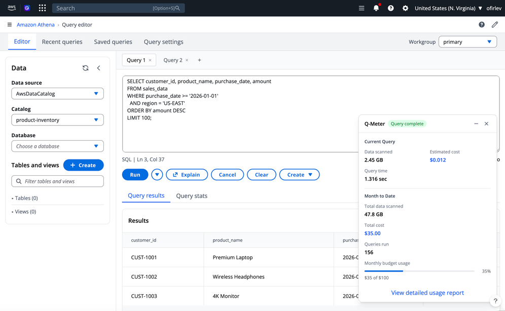
The design evolved through multiple wireframe iterations, mapping the widget's behavior across query execution states (pre-run, running, completed) and pricing models (pay-as-you-go vs provisioned capacity) before visual refinement.

Concept Wireframes Query Analyzer — Pre-run, Running, Completed States
Query analyzer wireframes showing three states: pre-query analysis with estimated impact and optimization opportunities, query running with live metrics and performance indicators, and query completed with account impact and optimization score B+ (83/100)
Query Buddy widget expands contextually during query lifecycle. Pre-query: Shows estimated data to scan (2.3GB), estimated cost ($0.012), Free Tier impact (0.2%), with optimization opportunities (add partition filter -40% data, convert to Parquet -60% cost). Running: Live metrics display data scanned progress (1.8GB of 2.3GB), current cost ($0.009), elapsed time (00:02:15), with performance indicators for partition pruning, column pruning, and compression. Completed: Full summary with account impact (Free Tier 844.2GB remaining, monthly spend $127.51) and optimization score of B+ (83/100) broken down by query structure (Efficient), data format (Could improve), and partitioning (Well utilized).
Concept Wireframes Usage Analysis Dashboard — Full-Page View
Full-page usage analysis dashboard in AWS console navigation showing cost overview ($127.50 of $500, 25.5% with departmental breakdown), usage trends chart of daily spend, top cost drivers list, and alerts & recommendations panel
Expanded usage analysis dashboard accessible from Athena Administration menu. Four-panel layout: Cost Overview (Total: $127.50 / $500 at 25.5% with departmental breakdown - Marketing 45%, Finance 30%, Operations 25%), Usage Trends (Daily spend chart over 28 days), Top Cost Drivers (1. daily_report.sql at $8.50/day averaging 127GB, 2. customer_analysis.sql at $6.28/run averaging 89GB, 3. monthly_summary.sql at $4.88/run averaging 67GB), and Alerts & Recommendations (Marketing 80% of budget, 3 queries >100GB scanned, CSV format detected, Partition optimization available). Bottom toolbar offers Export Report, Configure, Share Dashboard, and Schedule Email actions.
Concept Wireframes Budget Alert & Usage Companion Settings
Two panels: Budget Alert showing Marketing Department at $240 current spend vs $300 budget with spending velocity at 80%, recommended actions including enable query throttling and implement suggested optimizations, and quick fixes estimating 40% savings; Usage Companion Settings panel showing display preferences, notifications, budget management, optimization, and team settings options
Left: Budget Alert modal for Marketing Department showing current spend ($240.00), monthly budget ($300.00), projected spend ($380.00), days remaining (8), and spending velocity at 80% (+15% vs last week). Recommended Actions include enabling query throttling at 90%, notifying team lead immediately, implementing suggested optimizations, and requesting budget increase. Quick Fixes section estimates 40% savings through converting 3 CSV datasets to Parquet, adding partition filters to daily reports, and optimizing customer_analysis query. Right: Usage Companion Settings panel with sections for Display Preferences (widget position, default state, theme, always show cost estimates), Notifications (budget alerts at 75%/90%/100%, email notifications, in-console alerts, weekly usage summaries), Budget Management (monthly budget $500, department Marketing, cost center ICC-2024-001, auto-throttle at 95%), Optimization (show pre-query estimates, real-time optimization hints, auto-suggest data format improvements, enable AI-powered recommendations), and Team Settings for manager view (show team usage breakdown, enable cross-department visibility, share optimization recommendations, report frequency: weekly).
Prototype Development Wireframe Exploration Process — VS Code + Kiro
Vibe coding process showing VS Code with HTML/CSS/JS code on left combining with mockup iterations to create interactive Free Tier usage monitor widget prototype showing 63% usage (630.2 GB of 1000 GB), 1,248 queries, 18 days left, $0.00 overage
Early wireframe exploration through VS Code and Kiro to quickly test layout logic, information hierarchy, and state behavior with stakeholders. Iterations focused on how usage, query status, and cost signals should be framed before moving into polished visual mockups.
Initial Vibe-Coded Mockups Provisioned Capacity Pricing View — Expanded & Collapsed States
Athena Query Editor with Provisioned Capacity pricing model showing Usage & Cost widget in both expanded state (current session: 12.7 GB data scanned, $0.64 cost, 5 queries run; provisioned capacity showing 51% utilized at $2.40/hour with View Detailed Costs and Optimize Queries buttons) and collapsed state (Set up button)
Query Editor interface with Provisioned Capacity model. Expanded widget (left) shows Current Session metrics (Data Scanned: 12.7 GB, Est. Cost: $0.64, Queries Run: 5) and Provisioned Capacity status (51% utilized at 10200 DPUs for $2.40/hour with View Detailed Costs and Optimize Queries CTAs). Collapsed widget (right) displays minimal state with Set up CTA, demonstrating the widget's ability to adapt to available screen real estate without disrupting the query editor workflow.
08 — Mockups

Visual design directions and interaction refinement

After validating the wireframe structure, I translated the strongest directions into high-fidelity mockups to evaluate visual hierarchy, urgency signaling, and intervention timing in realistic Athena workflows.

Final Design Mockups Athena Usage Widget — Concept Variation 1
Athena usage widget mockup variation 1
Concept variation 1 explores a compact status-forward layout emphasizing quick readability of usage progress, query activity, and Free Tier context.
Final Design Mockups Athena Usage Widget — Concept Variation 2
Athena usage widget mockup variation 2
Concept variation 2 tests a denser information hierarchy to compare discoverability of query impact signals and optimization opportunities.
Final Design Mockups Athena Usage Widget — Concept Variation 3
Athena usage widget mockup variation 3
Concept variation 3 evaluates a more guided interaction model, focusing on intervention timing and progressive cost-awareness messaging during execution flow.

Using AI prototyping tools

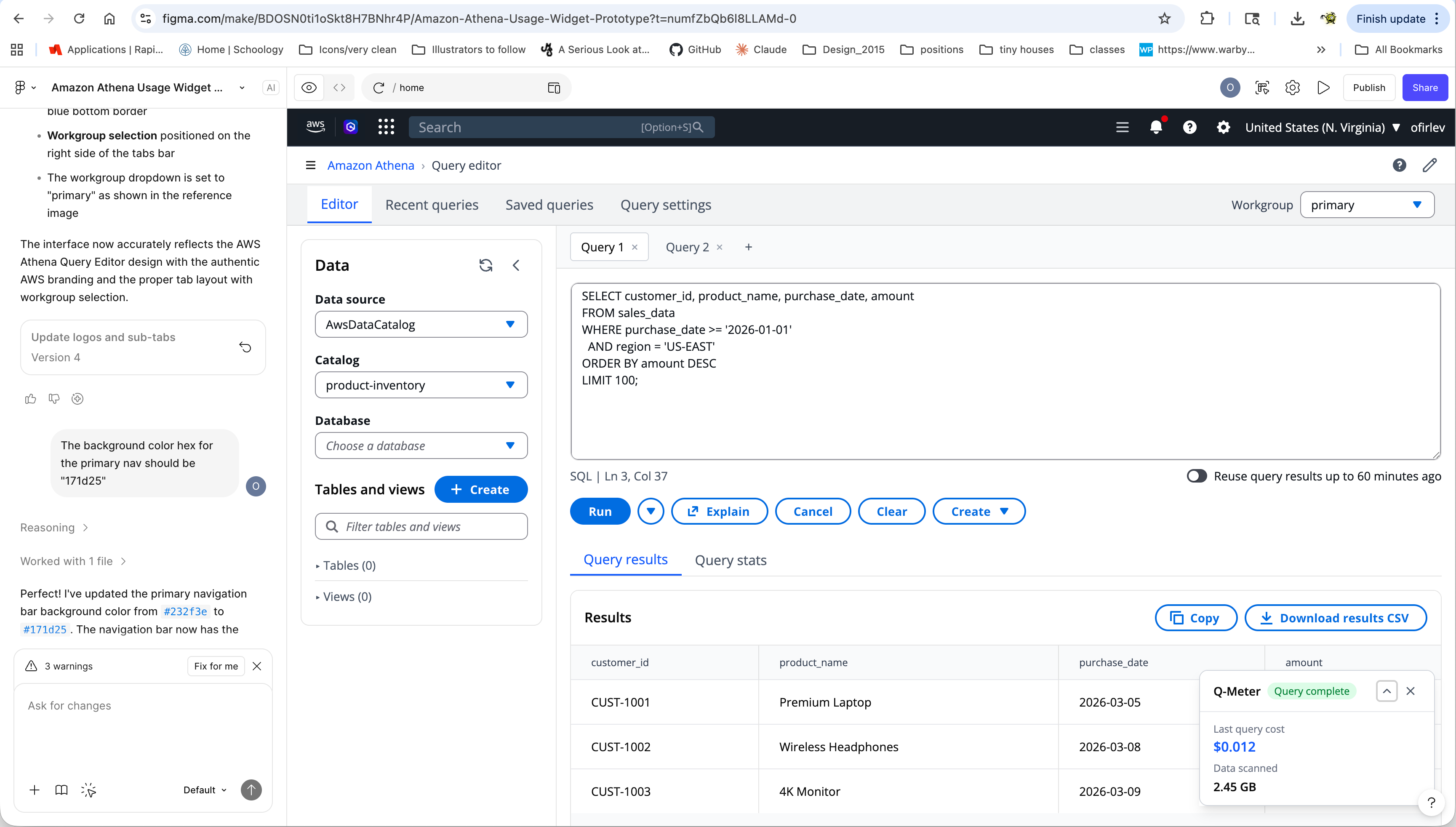
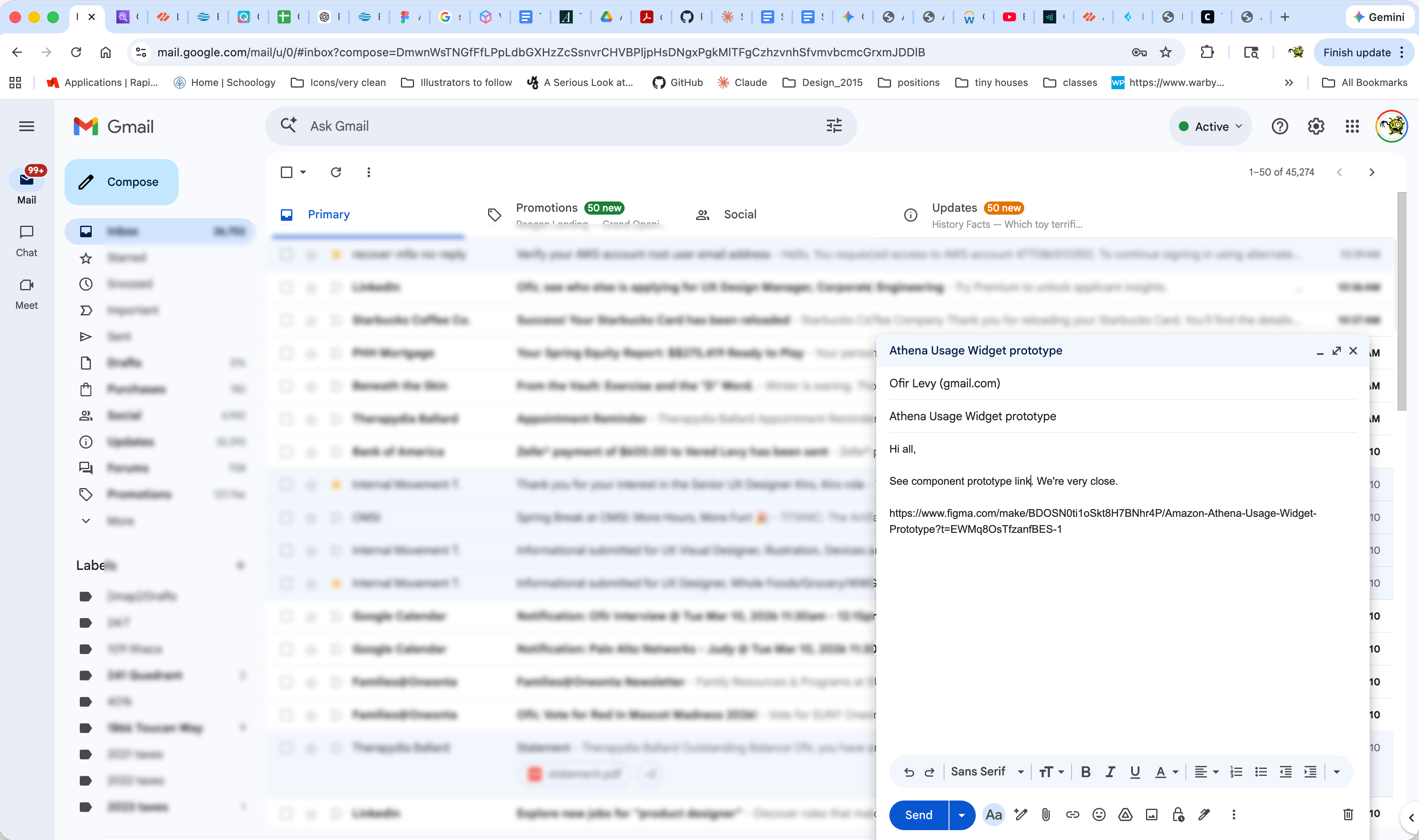
I used Figma Make together with GitHub to rapidly generate interactive prototype directions, host implementation-ready updates, and share a live prototype link with cross-functional partners. This workflow shortened feedback loops and accelerated project development by making iteration, review, and alignment happen in near real time.

PREVIEW THE INTERACTIVE PROTOTYPE

AI-assisted concept to prototype collaboration flow

I used AI-supported tools to rapidly generate concept directions, refine mockups, and publish interactive prototypes for cross-functional partner reviews. This workflow accelerated iteration speed while keeping decisions grounded in usability and business constraints.

Design Workflow Step 1 — Generate initial concepts in Figma Make
Design workflow step 1 in Figma Make
Started with AI-assisted concept generation in Figma Make to quickly explore layout and interaction directions.
Design Workflow Step 2 — Refine interaction patterns in Figma Design
Design workflow step 2 in Figma Design
Refined visual hierarchy, component behavior, and interaction details in Figma Design for stakeholder-ready fidelity.
Design Workflow Step 3 — Publish implementation updates via GitHub
Design workflow step 3 publishing to GitHub
Published iterative updates through GitHub to keep the prototype implementation and review artifacts synchronized.
Design Workflow Step 4 — Share live prototype links with partners
Design workflow step 4 sharing prototype link
Shared live prototype links with cross-functional partners to accelerate feedback cycles and alignment.
Design Workflow Step 5 — Update website case study in VS Code
Design workflow step 5 website update in VS Code
Fed approved outputs back into the case-study narrative and codebase to keep documentation current with the latest prototype state.
70%
Target widget activation rate among active Athena users within 90 days of launch
30%
Expected reduction in unexpected charges and cost-related support tickets
WIP
Currently in concept validation phase — wireframes and vibe-coded prototypes under review
← Return to design case studies