Western Digital · 2014 Mobile App · UX Design · iOS

WD Remote — The Phone as the Remote

Western Digital’s WDTV media box was a formidable product — powerful, media-rich, and connected to everything. But it came with a physical remote that riders kept losing, found confusing, and felt limited by. I designed WD Remote: a full-featured iOS app that replaced the hardware remote entirely, turning the phone customers already had in their hands into the most capable WDTV controller ever built.

Platform
iOS (iPhone & iPad)
Year
2014
My Role
UX Design Lead
Team
PM, iOS developers, QA
← All work

Project summary

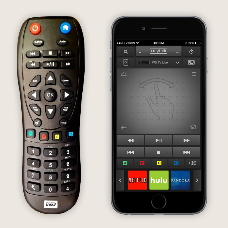
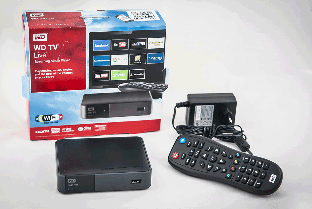
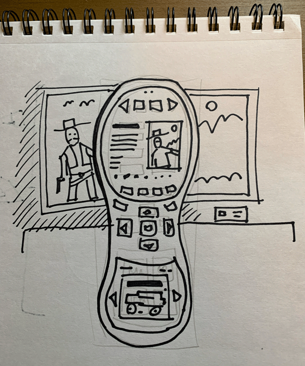
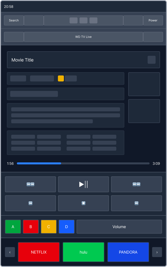
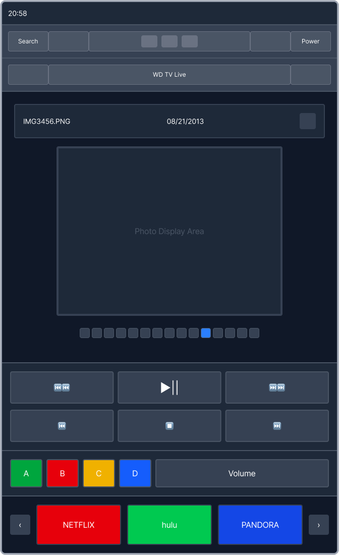
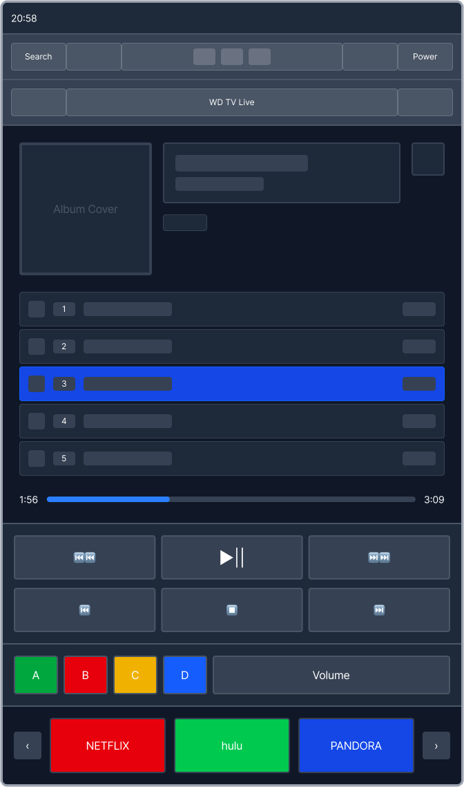
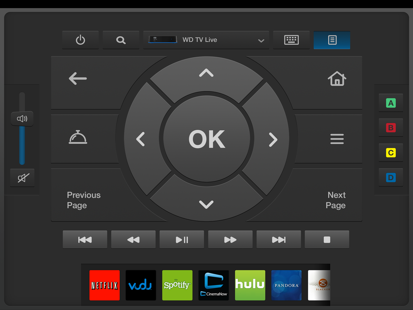
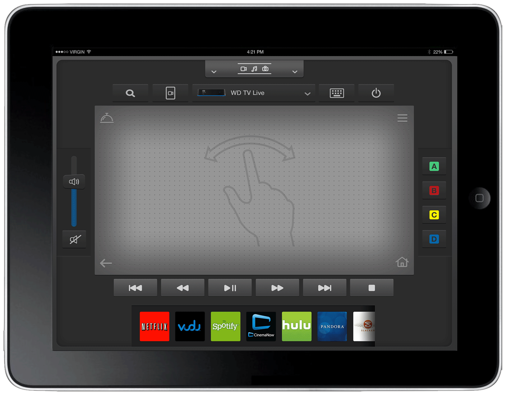
WDTV was Western Digital’s answer to the media box category — a powerful hub connecting WD NAS devices, WD Passport drives, and streaming services like Netflix, Amazon Prime, and Roku. It was a compelling product, but the hardware remote it shipped with was holding the whole experience back. Customers lost it constantly. When they did find it, they struggled to operate it. And even when they got it working, its limited button layout left the deeper features of WDTV out of reach.

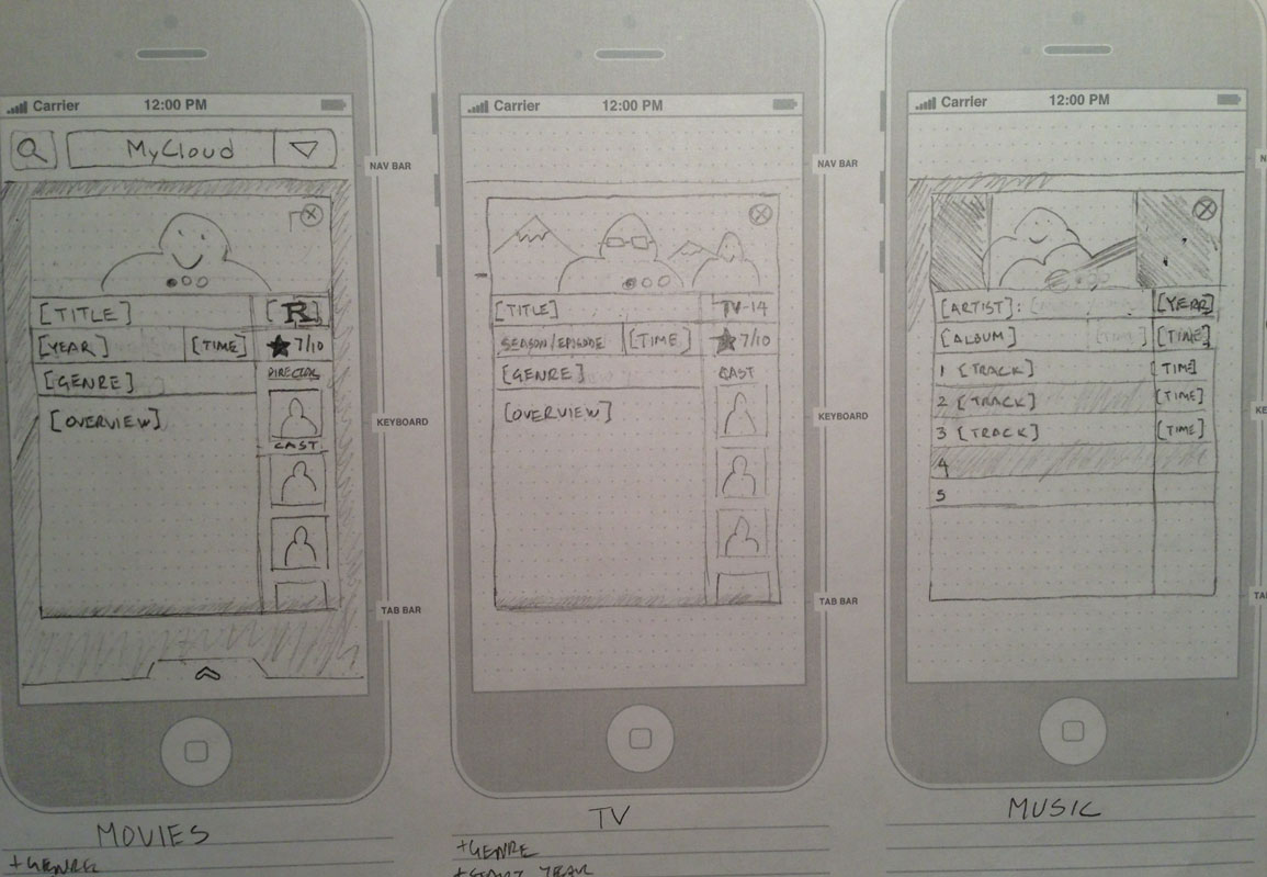
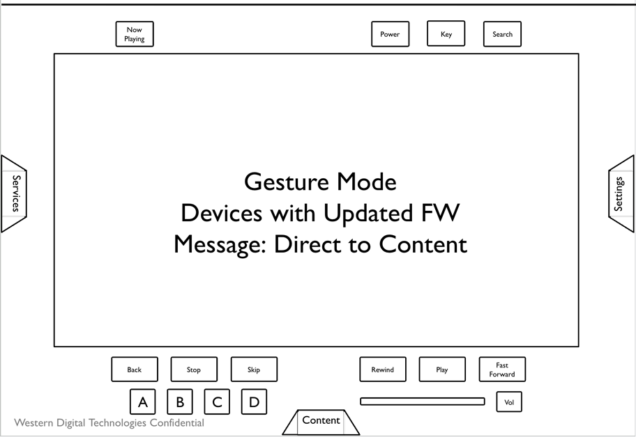
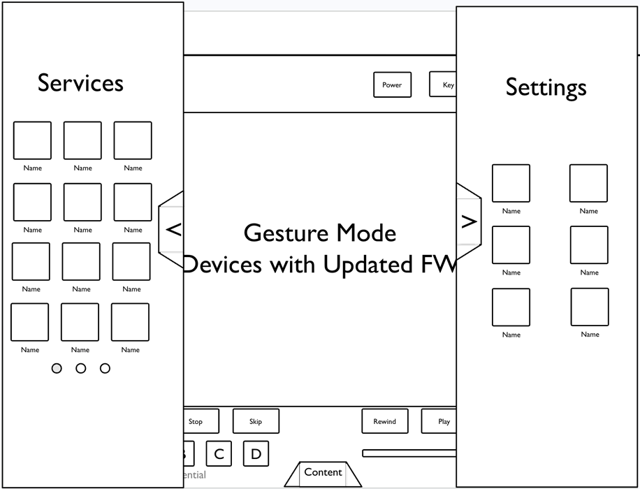
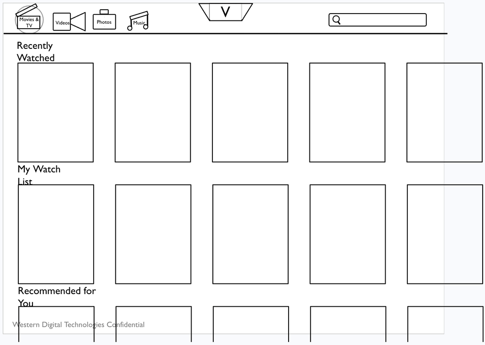
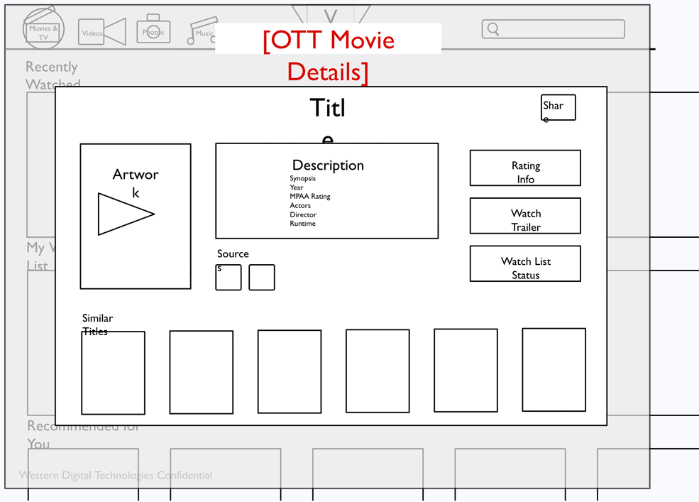
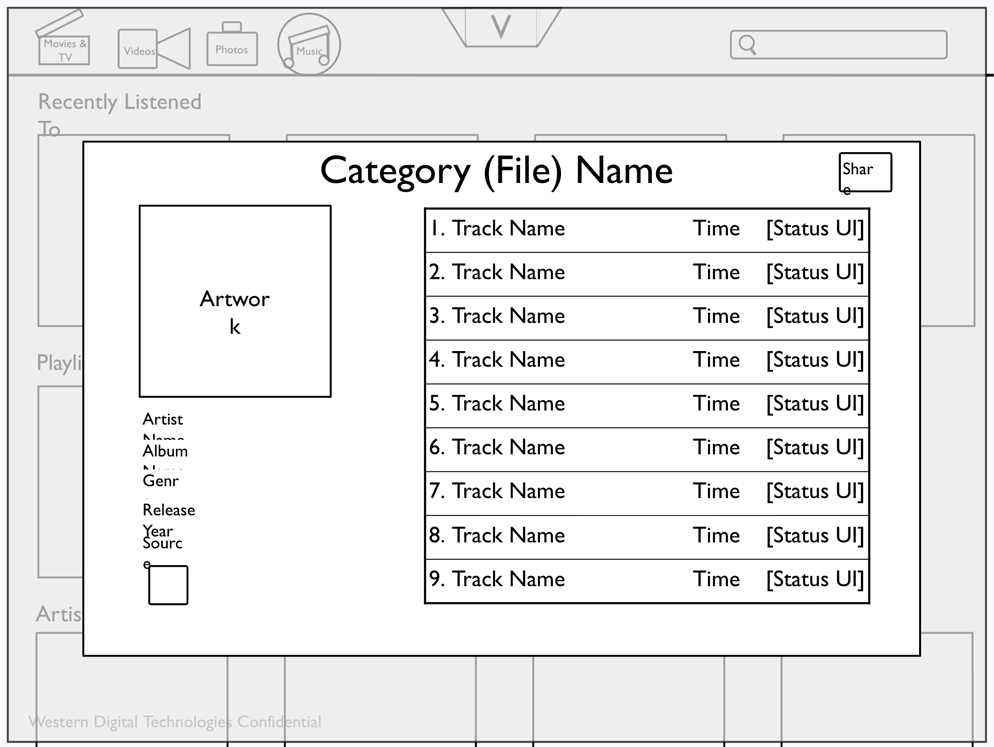
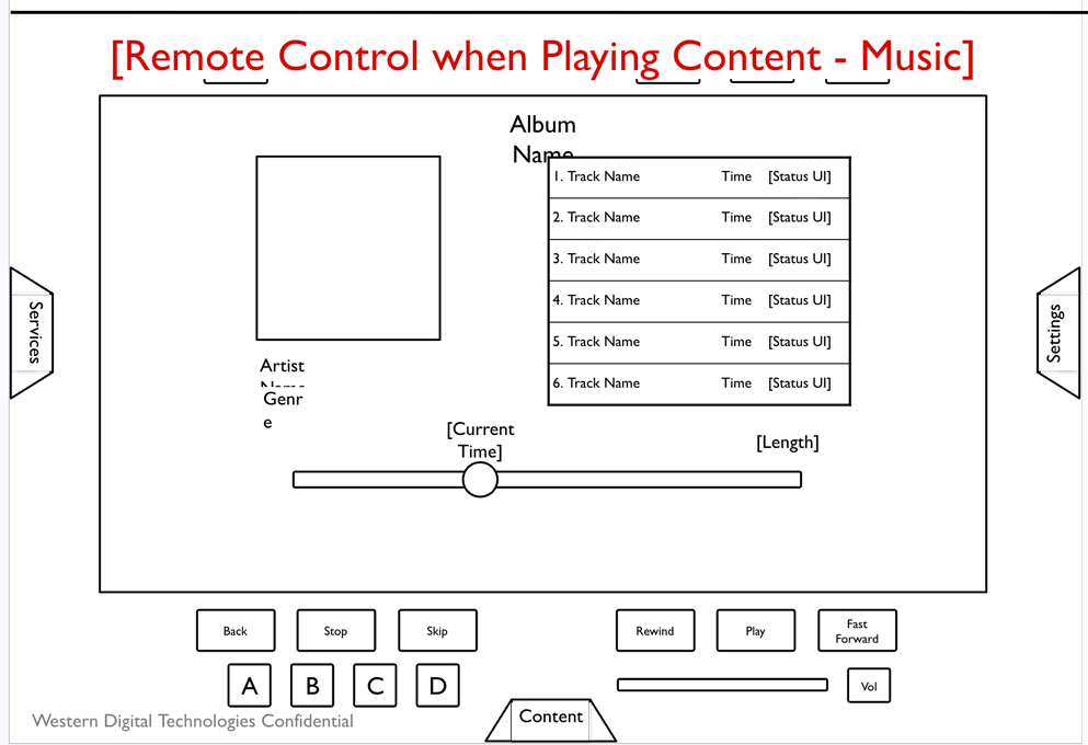
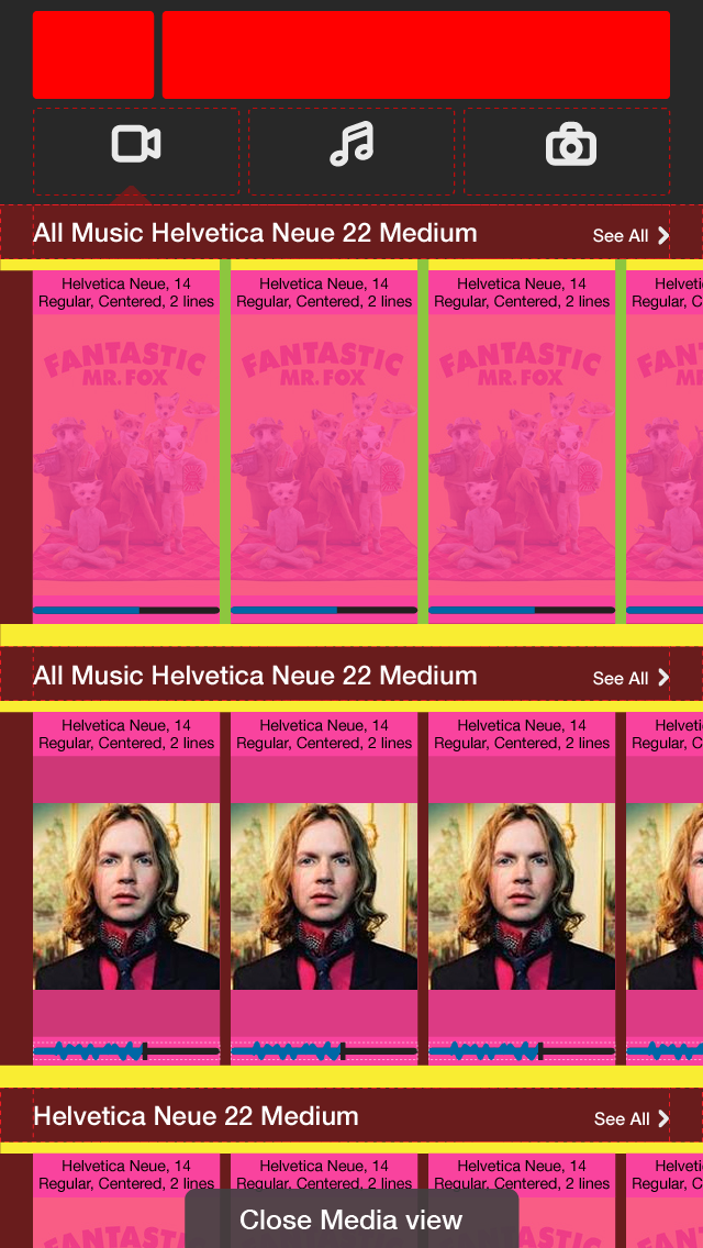
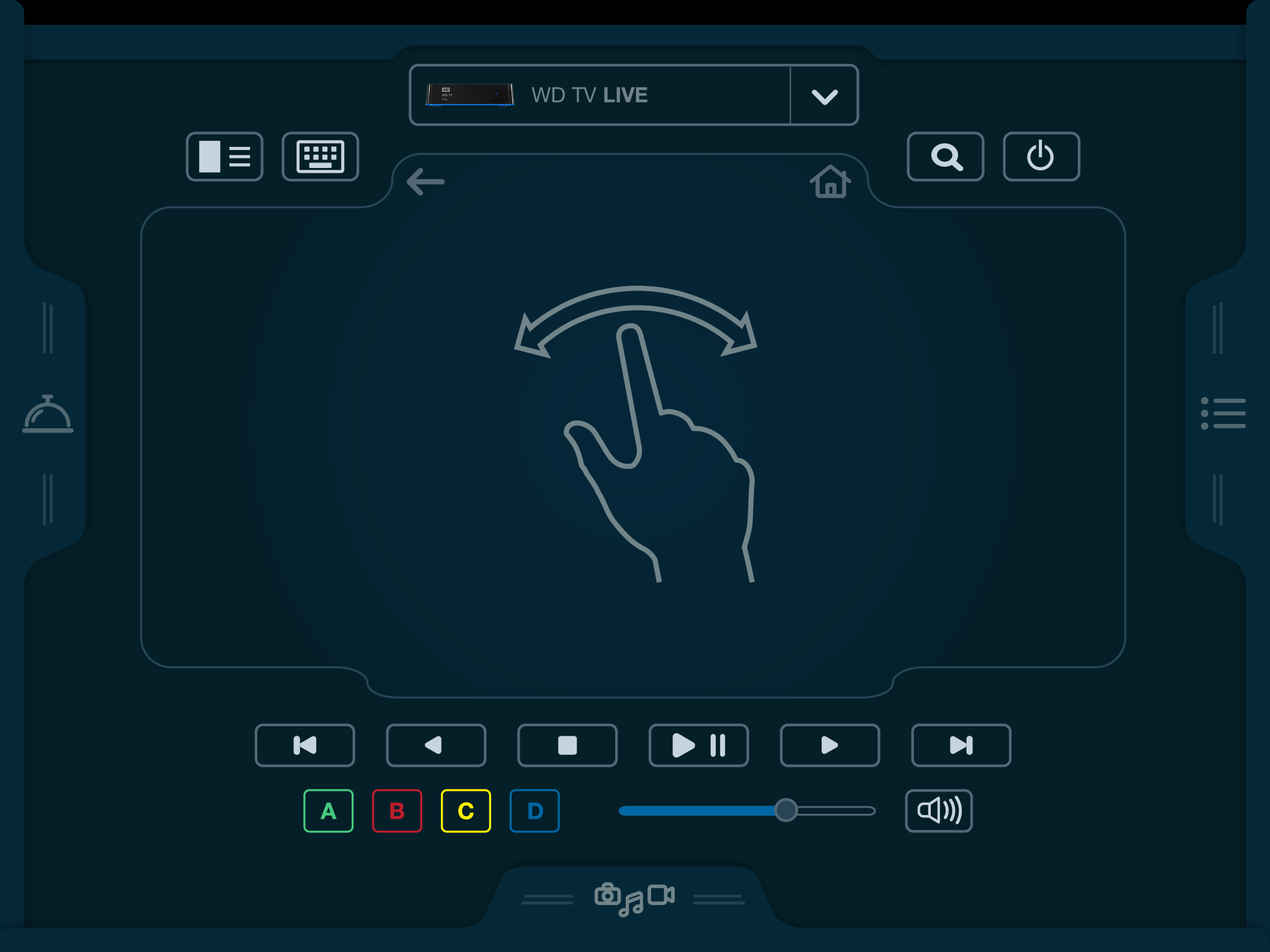
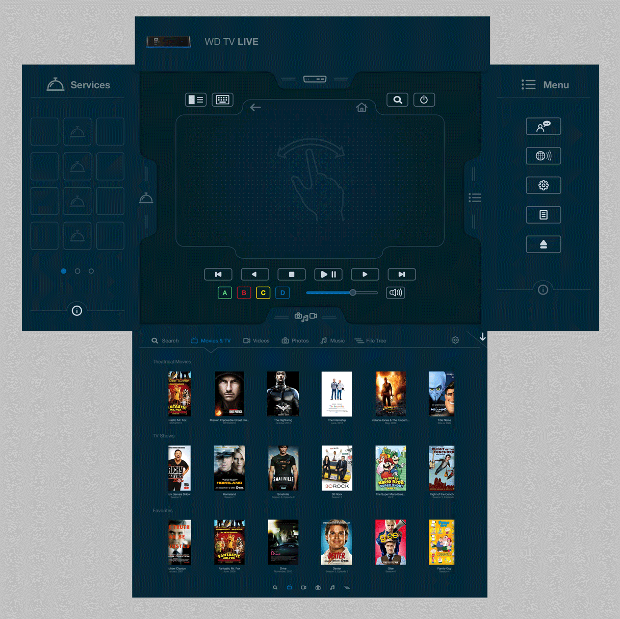
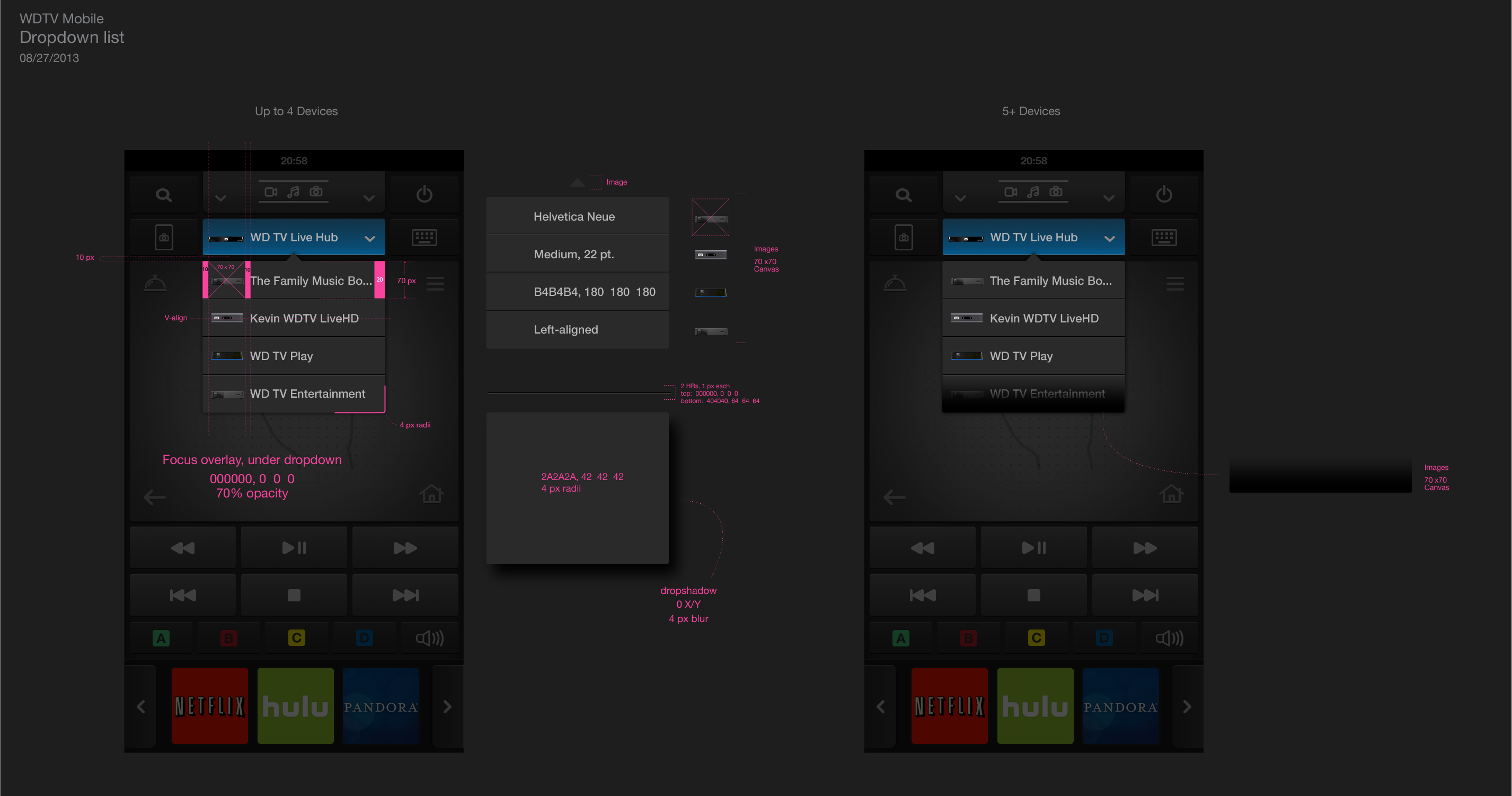
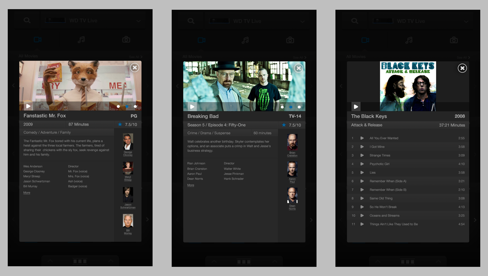
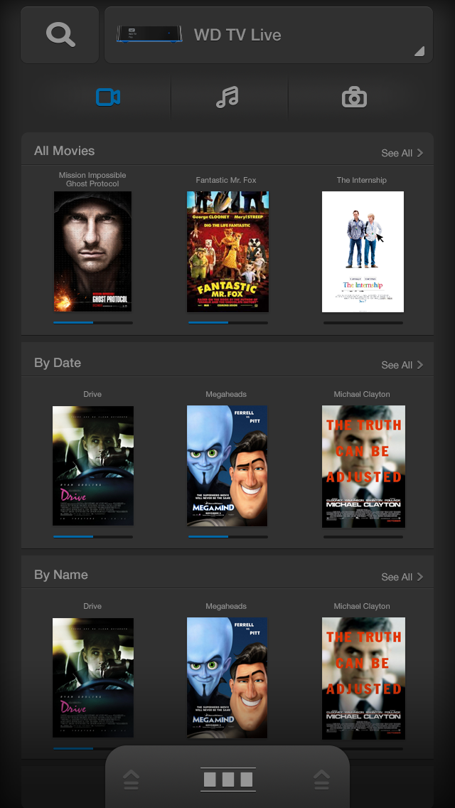
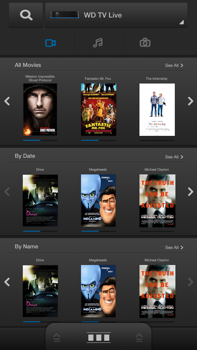
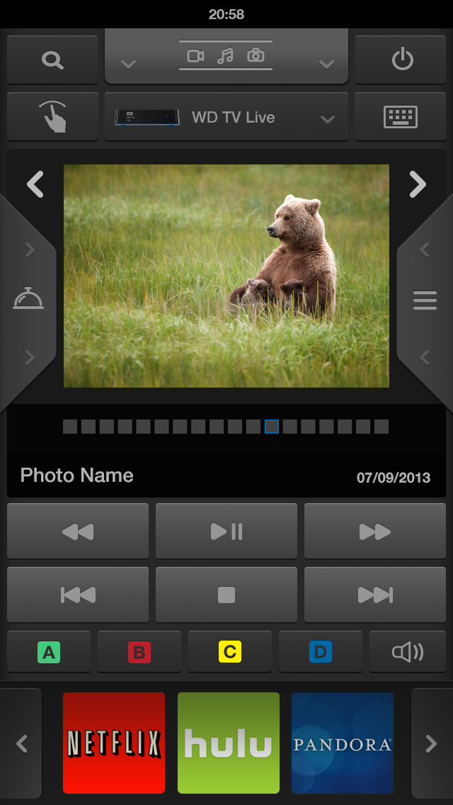
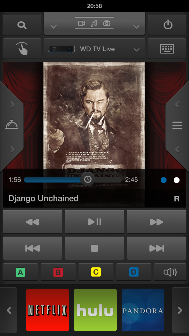
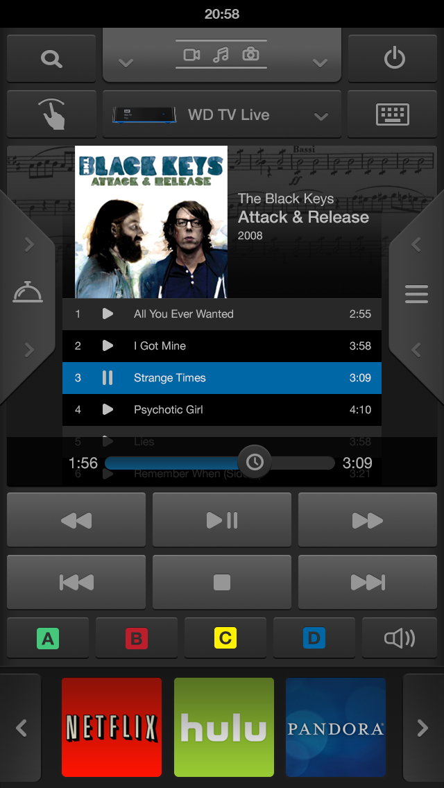
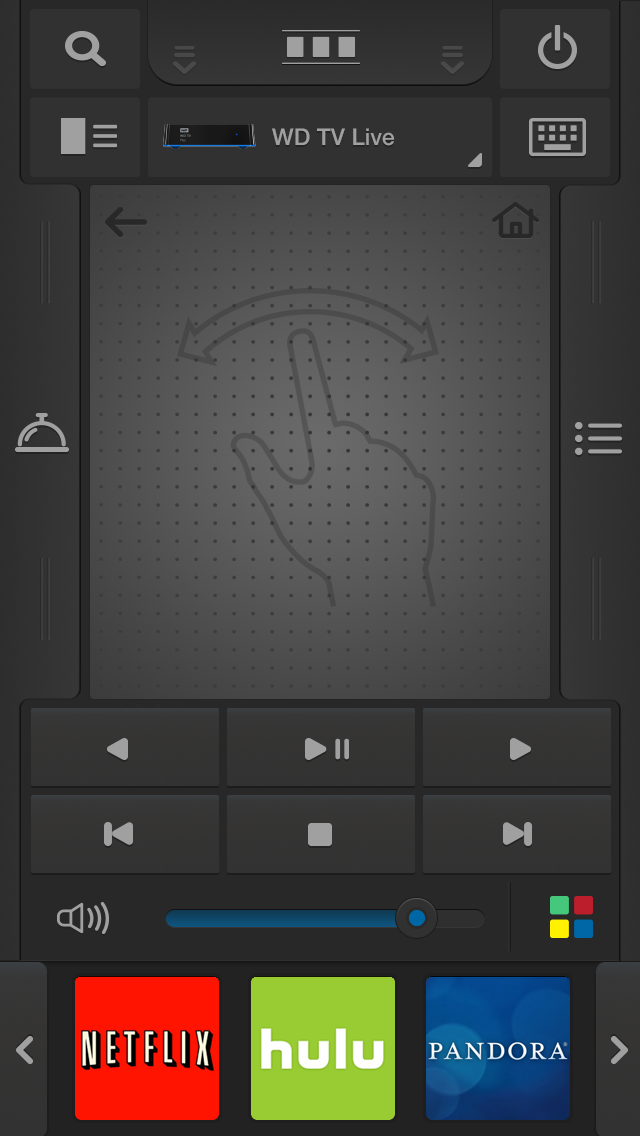
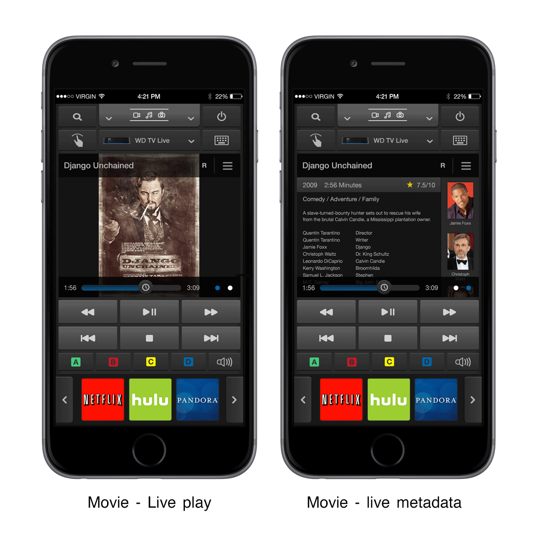
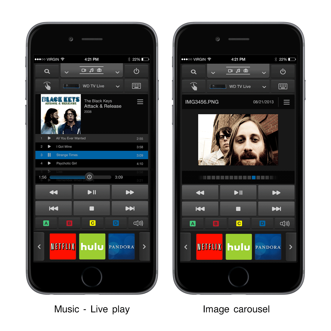
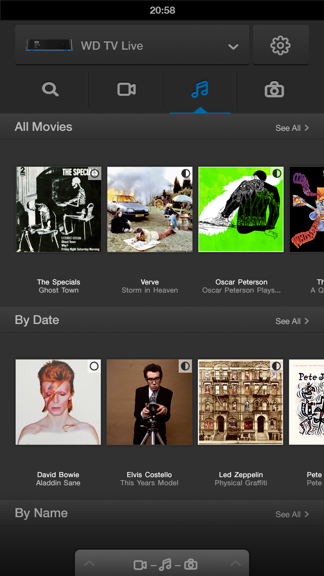
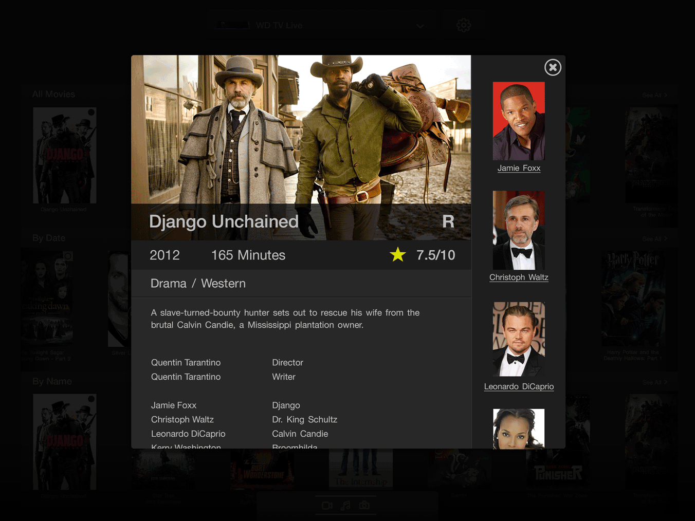
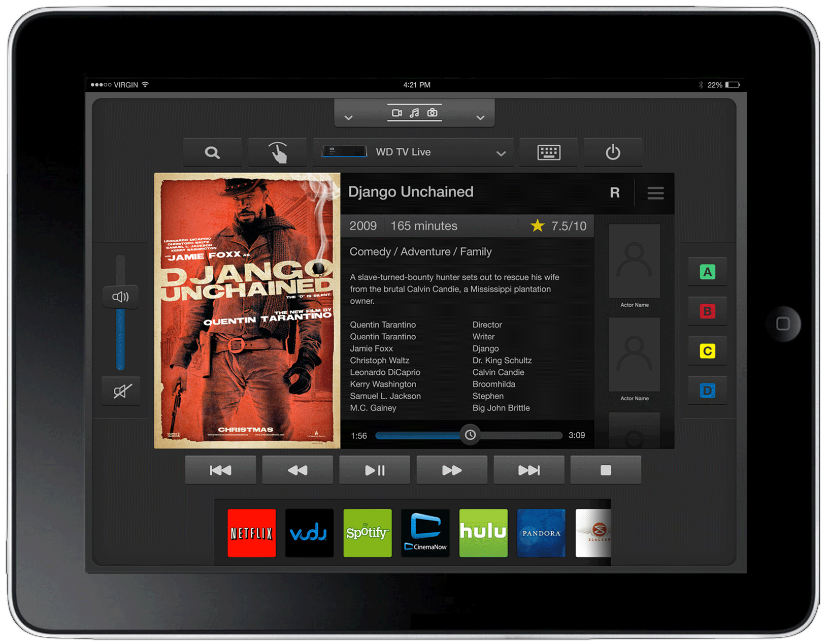
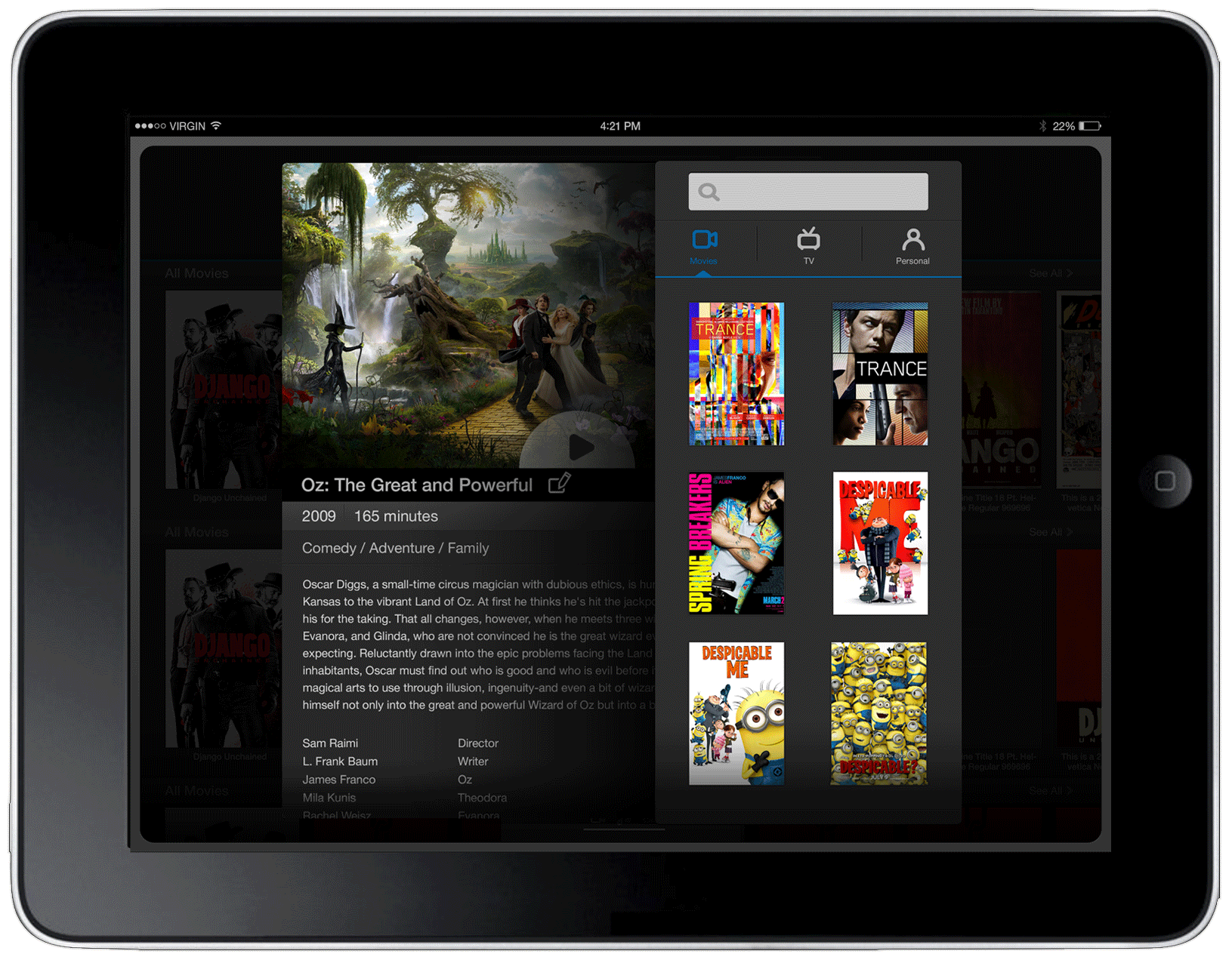
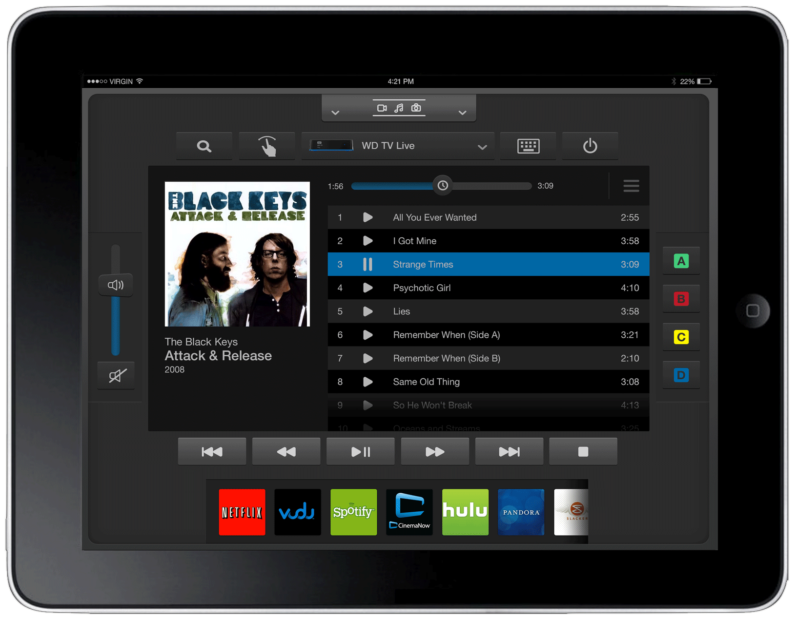
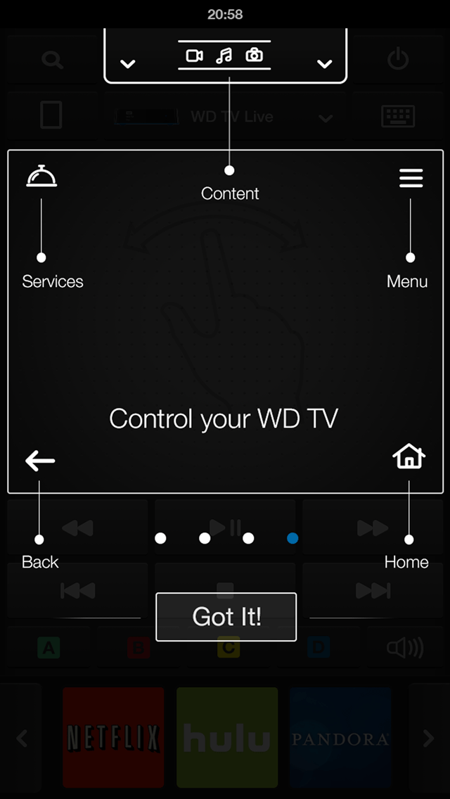
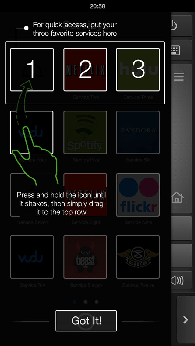
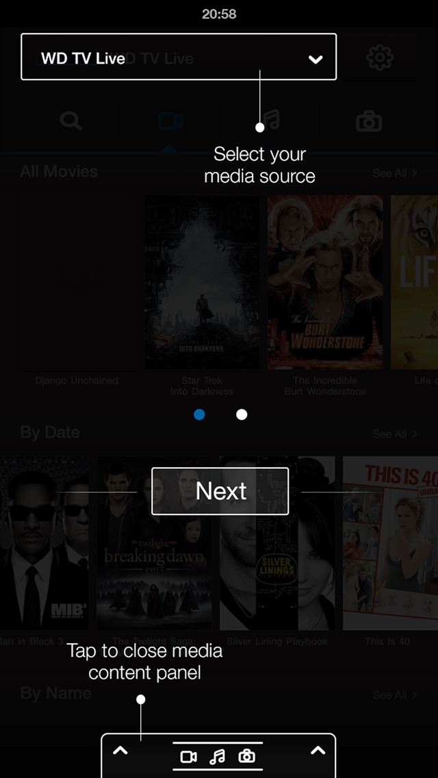
WD Remote reimagined what a remote could be. Instead of a plastic device with a handful of buttons, customers now had a rich, intelligent, media-aware app on the phone they were already holding. It connected to WDTV over Wi-Fi, giving full control of playback, navigation, content browsing, and media metadata — with a visual experience sophisticated enough to match the WDTV product itself.

WD Remote app preview

Project E2E workflow

Step 01

Customer Research & Discovery

Shadowing WDTV customers in real use, observing behaviors with the physical remote, and identifying the friction, confusion, and unmet needs driving the problem.

Step 02

Problem Definition & Brief

Translating research findings into a clear design brief and leadership presentations that defined the problem space and framed the mobile app as the right solution.

Step 03

Partner Collaboration & Persona

Working closely with PM and developers to define the app persona and align on scope through facilitated workshops before design work began.

Step 04

User Workflow & Journey Mapping

Mapping the full customer journey across device setup, content browsing, playback control, and media metadata display to define the app’s structural backbone.

Step 05

Sketches & Wireframes

Extensive low-fidelity exploration of the multi-dimensional interaction model — moving screens, drawers, playback controls, and media content surfaces — across phone and tablet form factors.

Step 06

Visual Design & Components

High-fidelity design built on the WD media style guide, extended with custom components, icons, and an industrial dark visual theme that matched WDTV’s product identity.

Step 07

Onboarding & Prototype Testing

Designing coach mark onboarding for the ground-breaking interactions, then testing the gamma build with customers to validate clarity, flow, and enthusiasm before release.

Step 08

Release & Continuous Improvement

App Store launch in 2014, followed by ongoing collaboration with PM and SDEs to itemize, prioritize, and ship customer-driven feature corrections and improvements.

01 — Context & Problem

A great product held back by its own remote

WDTV was one of Western Digital’s most ambitious consumer products — a media hub that connected WD MyCloud NAS devices, WD Passport drives, and popular streaming services including Netflix, Amazon Prime, and Roku into a single living-room experience. It was a serious competitor to AppleTV.

But the hardware remote that shipped with it was a constant source of friction. Customers lost it — regularly. The device slipped under cushions, got left in other rooms, and simply vanished. When found, it confused people: the button layout was opaque, and even straightforward actions required multiple steps customers couldn’t intuitively decode.

Worse, the remote was structurally limiting. Its small button set meant only a fraction of WDTV’s features were surfaceable. Customers were paying for a premium media experience and accessing only part of it.

“Customers were paying for a premium media experience and could only access part of it. The remote was the bottleneck.”
WDTV equipment context

The opportunity was clear: the phone customers were already holding was a better remote than anything Western Digital could manufacture and ship. It was always nearby, always charged, had a touchscreen that could surface rich UI, and was a device customers already knew how to use.

WD Remote would become the digital equivalent of the physical remote — and then far exceed it.

Problem 01

The remote kept going missing

Physical remotes are easy to lose. Customers were regularly unable to operate their WDTV because the remote had disappeared — ending the experience before it began.

Problem 02

The remote was hard to operate

Even when found, the button layout confused customers. Simple navigations required non-obvious sequences, creating frustration with a device that was supposed to be effortless.

Problem 03

The remote was structurally limiting

A handful of physical buttons couldn’t surface the full depth of WDTV. The hardware remote was an architectural constraint that prevented customers from accessing everything the product offered.

02 — Research

Getting close to the actual experience

Research began with direct customer observation. I shadowed customers as they interacted with WDTV in real environments — living rooms, bedrooms, home offices — and watched how the physical remote shaped (and limited) their behavior. I noted what they did, where they hesitated, what they skipped entirely, and what visibly frustrated them.

I documented findings in UX design briefs and summarized insights for leadership presentations, making the case that the remote was not a minor accessory issue but a core product experience failure with a clear design solution.

Beyond observation, I surveyed a pool of WDTV customers to pressure-test the mobile app hypothesis. Did customers feel their phone was a natural replacement for the remote? What would they expect from such an app? What would make them trust it over the hardware they’d been given?

The survey responses were unambiguous: customers were enthusiastic about the concept, particularly the idea of having rich content metadata, intuitive browsing, and playback control all in one place — something the physical remote fundamentally couldn’t offer.

Competitive scoring matrix

Six remote-control and media apps were evaluated across six dimensions on a three-point scale: strong (fully implemented, polished), partial (present but limited or inconsistent), or weak (absent or broken). WD Remote is shown as a target benchmark.

App Navigation Model Content Browsing Playback Control Media Metadata Multi-source Support Device Pairing
Apple Remote Strong Partial Strong Partial Weak Strong
Plex Remote Partial Strong Strong Strong Partial Partial
Roku App Strong Partial Strong Weak Weak Strong
Samsung SmartView Partial Partial Partial Weak Weak Partial
Logitech Harmony Strong Weak Strong Weak Strong Partial
XBMC Remote Partial Strong Strong Partial Partial Weak
WD Remote target Strong Strong Strong Strong Strong Strong
03 — Partner Collaboration

Building alignment before building the app

This project required close, early alignment with partners. I worked hand-in-hand with my PM and iOS developers throughout the workflow and journey mapping phase — not just to validate technical feasibility, but to ensure that design ambition and engineering scope were always calibrated together.

I facilitated a series of focused workshops with the core team to define the app’s persona: who was this for, what did they value, what moments in the WDTV experience did the app need to elevate, and where did the physical remote’s paradigm need to be entirely rethought rather than replicated?

These workshops were productive because they were grounded in the research. Patterns from customer observation gave the team shared context, and the persona work that emerged was specific and actionable — not a generic user archetype but a real picture of the WDTV customer base and what they were trying to accomplish in their living rooms.

Alignment at this stage proved critical later. The app’s multi-dimensional interaction model — drawers, playback states, media metadata, remote gestures — was complex enough that without early shared understanding, design and engineering could have easily diverged.

WD Remote design workshop
Collaborative on-line workshop to iron out the customer E2E workflow and align on sentiments
04 — User Workflow

Mapping the full customer journey

Before any wireframes were drawn, the complete user workflow was laid out: from initial app setup and WDTV pairing, through content source selection (WD NAS, Passport, streaming services), into browsing and playing media, and back out to settings, search, and playback management. Each step in the journey had distinct interaction requirements and UI contexts.

This workflow map became the team’s shared reference throughout the entire project — a single document that kept design, PM, and engineering oriented to the same end-to-end experience even as individual screens and interactions were being designed in detail.

WD Remote E2E user workflow map
05 — Sketches

Working through a multi-dimensional interaction

WD Remote was a genuinely complex interaction design challenge. Unlike a simple content browser or a standard media player, this app had to simultaneously function as a directional controller (replacing the physical d-pad), a content browser (surfacing movies, music, photos from multiple sources), a metadata display (artwork, descriptions, cast information from studio and label databases), and a playback command center.

These four modes had to coexist in a single coherent app, across both phone and tablet form factors, and transition between them fluidly as the customer’s context changed mid-session.

I spent a significant amount of time in sketches — visualizing interaction flows, navigation architecture, drawer behaviors, and screen transitions before committing to wireframe fidelity. Sketching allowed me to move fast, test ideas on paper, and identify structural problems early when changes were still free.

The phone sketches focused on the core remote paradigm: directional control, quick-access playback, and a compact media browsing surface. Tablet sketches explored how the larger canvas could unlock richer layouts, side drawers for services and settings, and more immersive content metadata presentation.

WD Remote concept sketch 1 WD Remote concept sketch 2 WD Remote phone interaction sketches
06 — Wireframes

Defining structure across phone and tablet

Wireframes translated sketches into a structured, testable layout system. The work covered both form factors in parallel, since the phone and tablet experiences shared the same underlying logic but had meaningfully different layouts, navigation patterns, and content density.

Tablet wireframes focused heavily on the main navigation architecture — how the left and right drawers organized media sources and settings, how the main content area transitioned between browsing and playback states, and how the remote control overlay sat on top of the content experience without obscuring it.

Phone wireframes prioritized the hand-held remote paradigm: a compact, gesture-friendly interface where directional control, media browsing, and playback commands were all within thumb reach. The interaction pattern for media source selection required its own dedicated flow, documented in annotated wireframe specs.

Content metadata was a significant wireframe focus. Displaying movie art, cast details, album art, and track information from studio and label databases meant designing a flexible metadata layout system that could accommodate varying levels of content richness without breaking.

Tablet wireframes

Tablet main screen navigation wireframe Tablet side drawers wireframe
Tablet wireframe: movie listings Tablet wireframe: movie detail
Tablet wireframe: music album list Tablet wireframe: music detail Tablet wireframe: TV show

Phone wireframes

Phone wireframe: movie
Movie detail
Phone wireframe: photo
Photo viewer
Phone wireframe: song
Song / music player

Wireframe specifications

Tablet specs: component layout Tablet specs: listings
Phone specs: listings Specs: box art and listings
Tablet wireframe spec: movie listings
Tablet wireframe: play mode layout Tablet product map: multi-screen interaction

Building the visual language of WD Remote

The visual design was grounded in the existing WD media style guide, but WD Remote needed its own extended component set — purpose-built for a mobile remote experience. The design direction was industrial, modern, and media-rich: a dark theme that prioritized content artwork, created visual continuity with WDTV’s physical product design, and made every interaction feel tactile and immediate.

I built a custom component library covering buttons, icons, surfaces, and interaction states, along with a media source selection interaction system and a flexible content metadata layout. These components had to work across phone and tablet, across movies, music, and photos, and across multiple states including browsing, playback, and settings.

WD Remote components artboard

Adobe Illustrator artboard — component and design language exploration workspace.

Button components

WD Remote button components

Icon set

WD Remote icon set

Media source selection was one of the most complex interaction surfaces to design. The app needed to elegantly switch between WD NAS storage, WD Passport, and streaming services — each with distinct navigation paradigms — without disorienting the customer.

Phone interaction: media source selection step 1
08 — High-Fidelity Comps

A world-class media experience, screen by screen

Final high-fidelity comps across the complete app experience — phone and tablet, movies, music, and photos, browsing and live playback modes. Tap any screen to view at full size.

Phone — Near-Final Comps

Phone comp: metadata
Movie metadata
Phone comp: movies listing 1
Movies listing — view 1
Phone comp: movies listing 2
Movies listing — view 2
Phone comp: photos
Photos browser
Phone comp: movie play mode
Movie — play mode
Phone comp: music play mode
Music — play mode
Phone comp: play mode finger scroll
Play mode — finger scroll gesture

Phone — final screens

Phone final mocks: movies
Phone final mocks: music and photos

Tablet — browsing & play mode

Tablet comp: music listing final
Tablet comp: play mode buttons
Play mode — transport controls
Tablet comp: movies metadata
Movies — metadata panel

Tablet — final glorified comps

Tablet final comp: main pad
Main remote pad — directional control
Tablet final comp: movie metadata live play
Movie metadata — live play mode
Tablet final comp: movie metadata search
Movie metadata — search view
Tablet final comp: music live play
Music — live play mode

Interactive prototypes

Explore the app interactions live in Figma. Two prototype flows are available: the movie setup and browsing experience, and the live playing mode.

▶ Prototype: Movie Setup ▶ Prototype: Playing Mode

Making the ground-breaking feel natural

WD Remote introduced interaction patterns that customers had never encountered in a remote control context before. Moving screens, animated drawers, gesture-based playback, media source switching — each of these was intuitive once understood, but required deliberate introduction the first time a customer opened the app.

I worked closely with my PM and developer partners, as well as directly with customers in test sessions, to design and refine an onboarding workflow built around coach marks. The approach was deliberate: rather than showing everything at once in a tutorial that most customers skip, coach marks surfaced guidance precisely in context — on the specific screen and at the exact moment the interaction was relevant. Customers learned by doing, not by reading ahead.

The coach mark system was applied to all initial screens and key interaction moments: first app launch, first media source selection, first time the remote control overlay appeared, and the playback gesture interactions. Each mark was written to be brief, specific, and action-oriented.

Gamma testing with customers validated the approach. The combination of familiar smartphone conventions, rich visual design, and contextual coach marks meant that customers who had been confused by the physical remote were navigating WD Remote confidently within their first session — and expressing genuine enthusiasm about what the app could do.

“Customers who had been confused by the physical remote were navigating WD Remote confidently within their first session.”
WD Remote onboarding coach mark screen 1 WD Remote onboarding coach mark screen 2 WD Remote onboarding coach mark screen 3

Experience the full onboarding flow as designed in the interactive prototype below.

▶ Prototype: App On-boarding
10 — Release & Post-Launch Results

Shipped to the App Store in 2014

WD Remote launched on the Apple App Store in 2014. The reception from WDTV customers was immediate and positive — the app addressed the exact pain points that research had surfaced, and customers responded with the enthusiasm that gamma testing had predicted.

The App Store reviews reflected what the design set out to achieve: customers who had been frustrated by the physical remote now had a tool that was always with them, always functional, and far more capable than anything that came in the box.

Post-launch, I continued working closely with the app PM and SDEs to collect, categorize, and prioritize customer feedback. Feature corrections and improvements were iterated in subsequent releases. This wasn’t treated as a ship-and-move-on project — the feedback loop with customers remained active, and each update was grounded in real observed behavior and expressed user need.

“A tool that was always with them, always functional, and far more capable than anything that came in the box.”
WD Remote App Store icon
I also designed the app icon
WD Remote App Store customer reviews
← Return to design case studies