08 — Design Iterations & Mocks
Finding the right visual language for speed
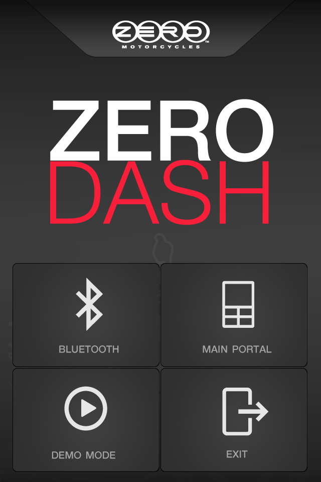
The visual design direction was non-negotiable: this was a performance app for a performance machine. The UI needed to feel at home in the same context as the motorcycle — dark, precise, high-contrast, and immediately readable. Cluttered interfaces kill focus. On a motorcycle, lost focus costs more than time.
Design iterations explored gauge styles, type hierarchy for speed and legibility, color temperature for day and night riding, and how to make the stat configuration experience feel tactile and satisfying without being complicated.
Component library
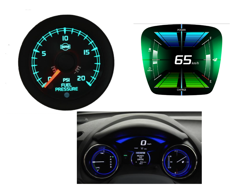
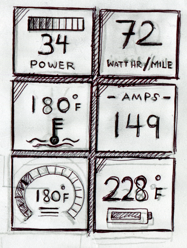
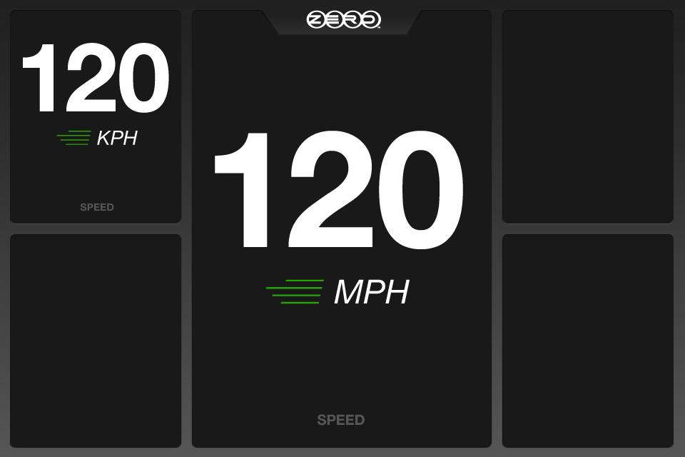
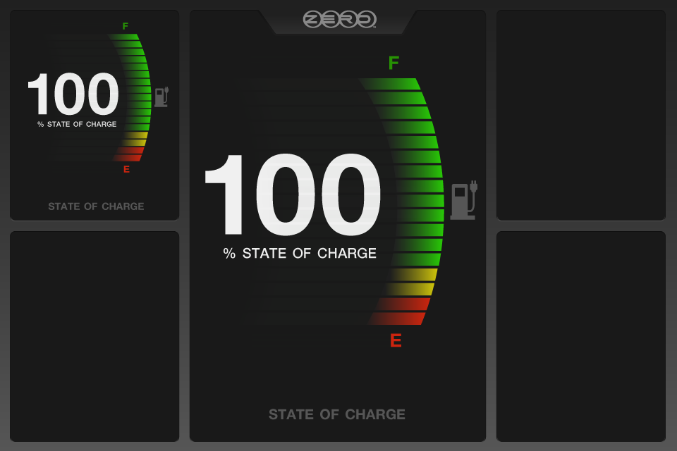
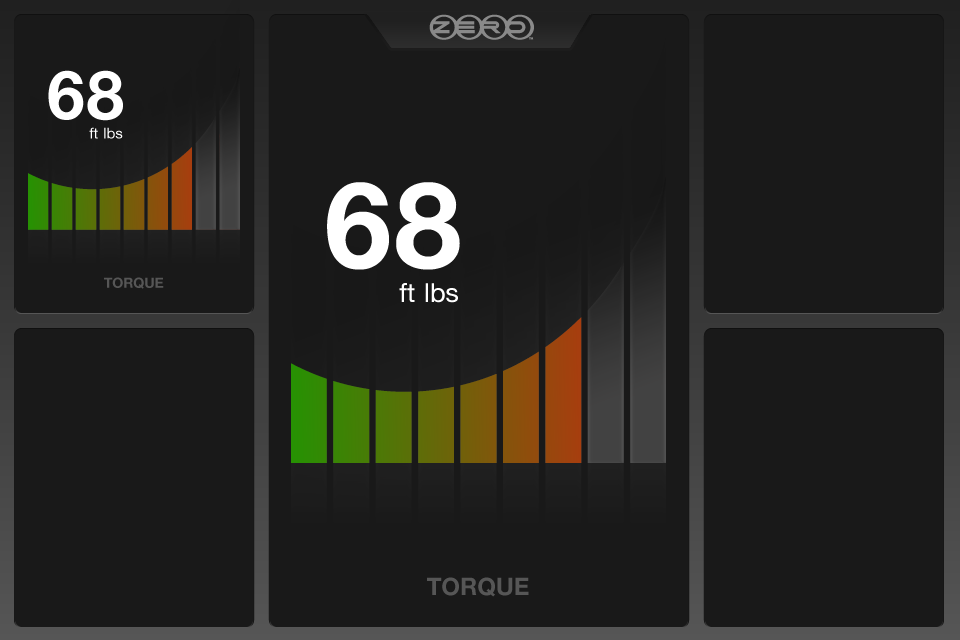
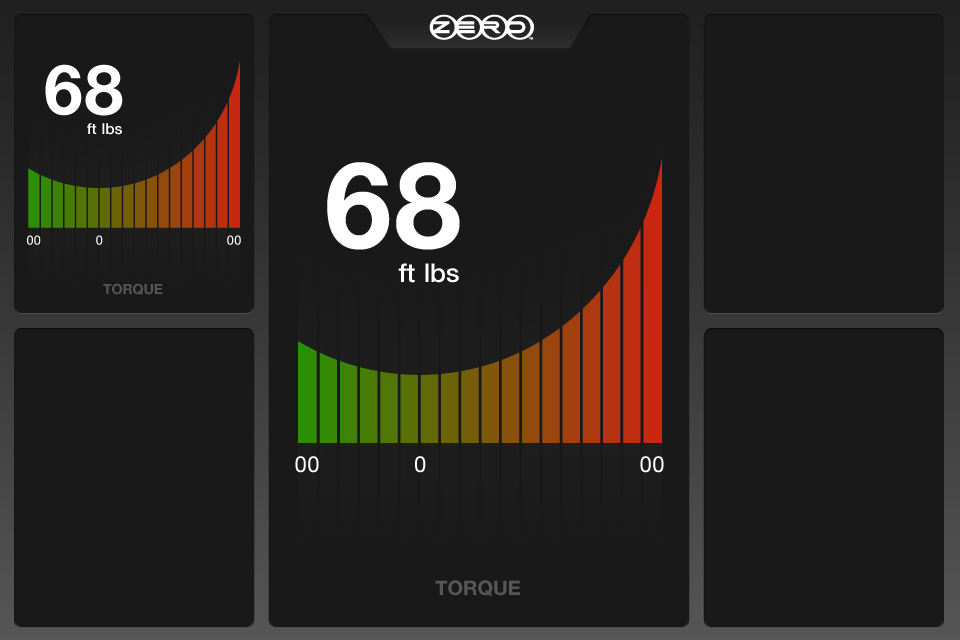
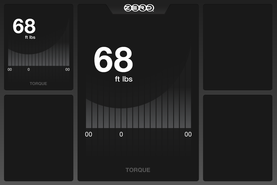
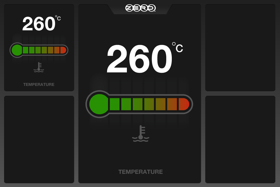
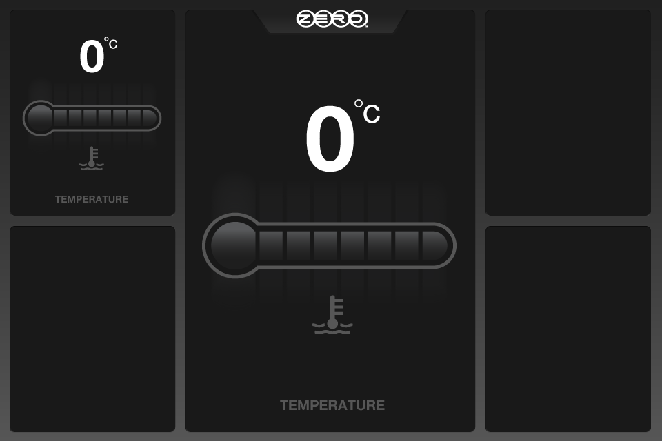
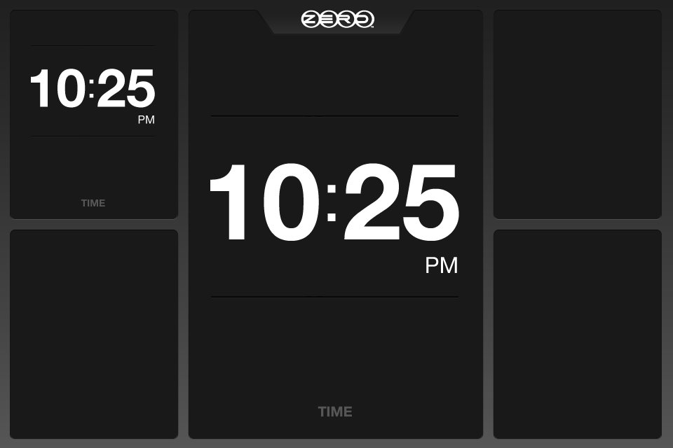
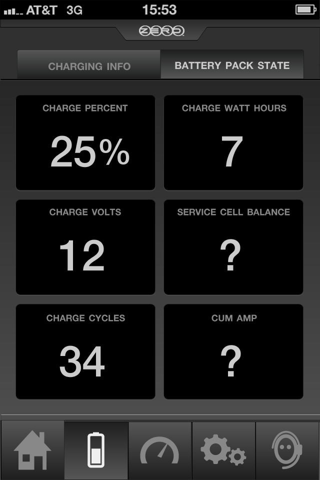
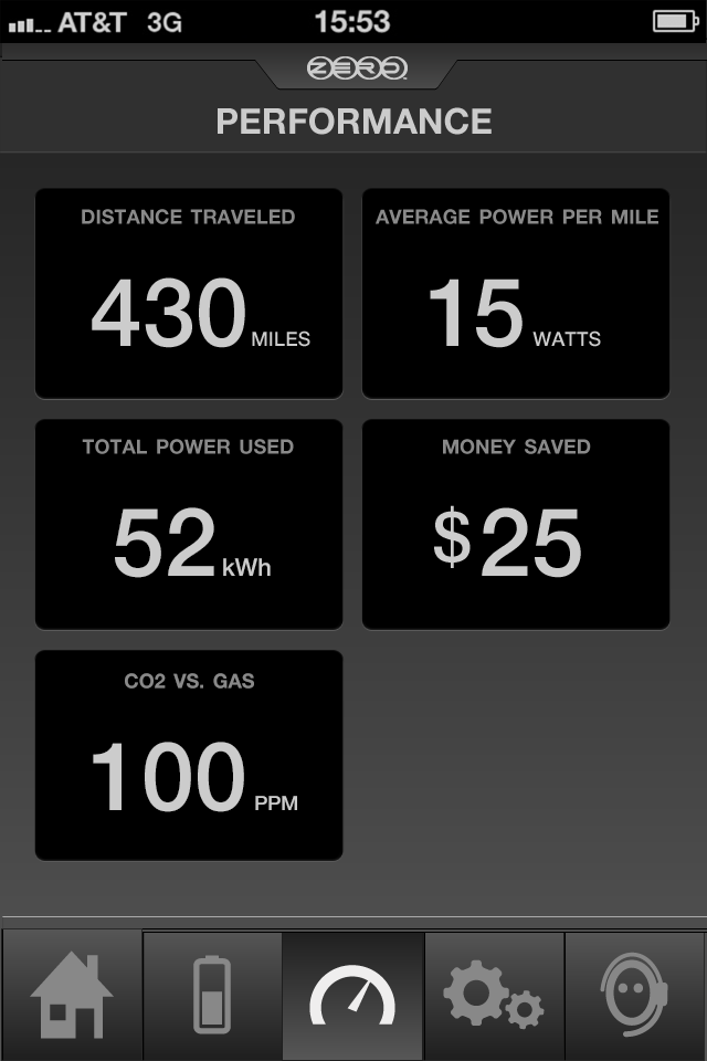
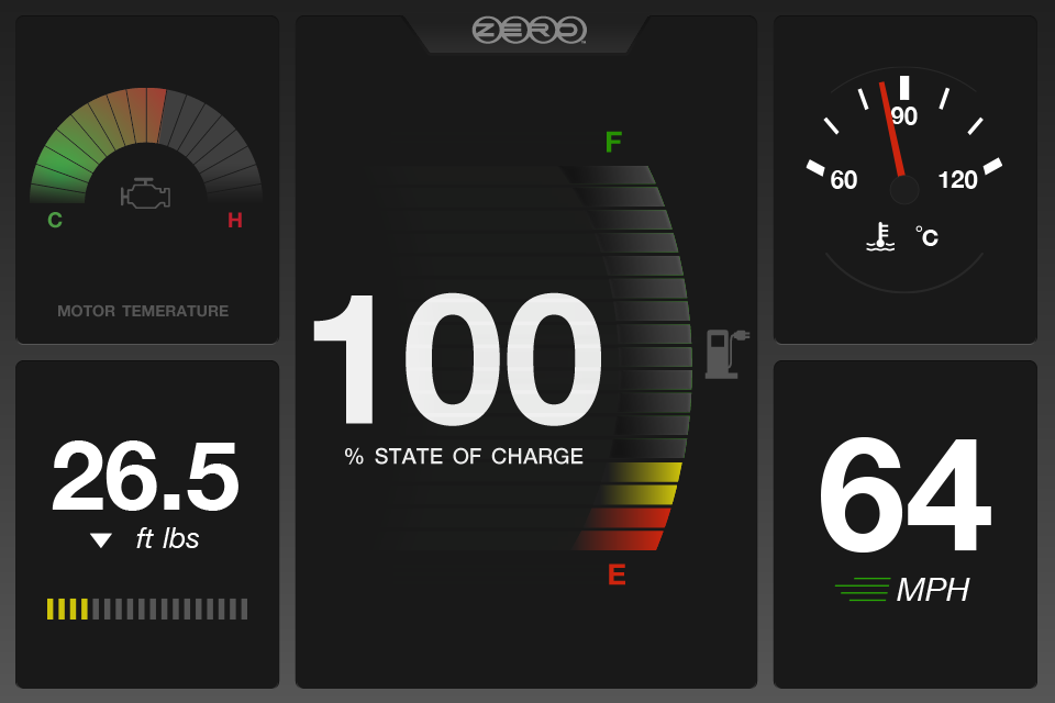
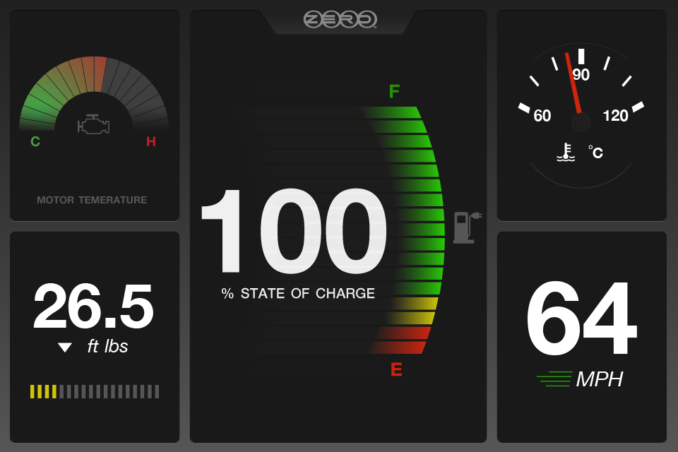
A dedicated component pass defined the full gauge library — each stat type (speed, battery, torque, temperature, time) had a purpose-built visual treatment designed for at-a-glance readability and consistent behavior across the dashboard grid.
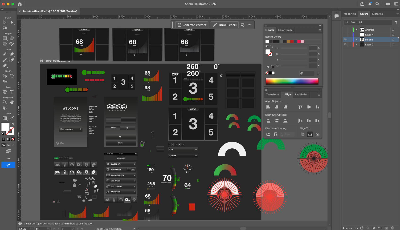
Adobe Illustrator artboard — the working canvas where I experimented with and built out the app’s design language and component library, iterating on gauge styles, color, and typography before translating them into final screen designs.
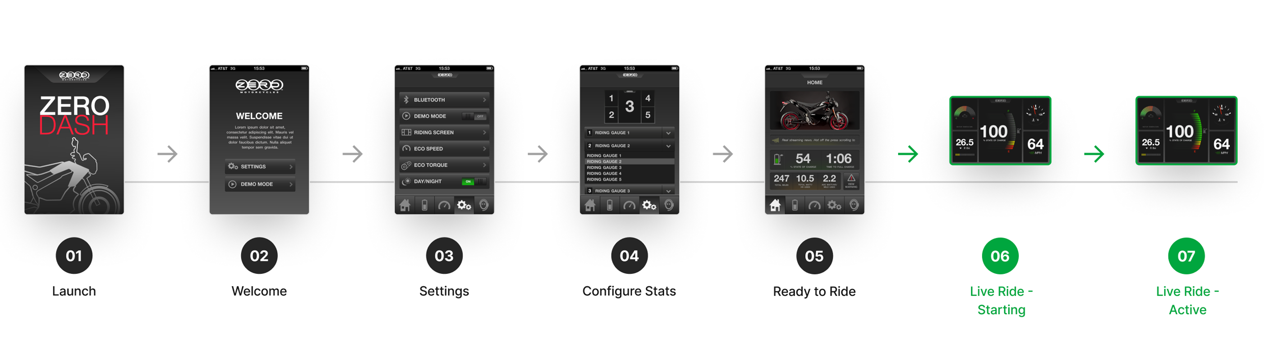
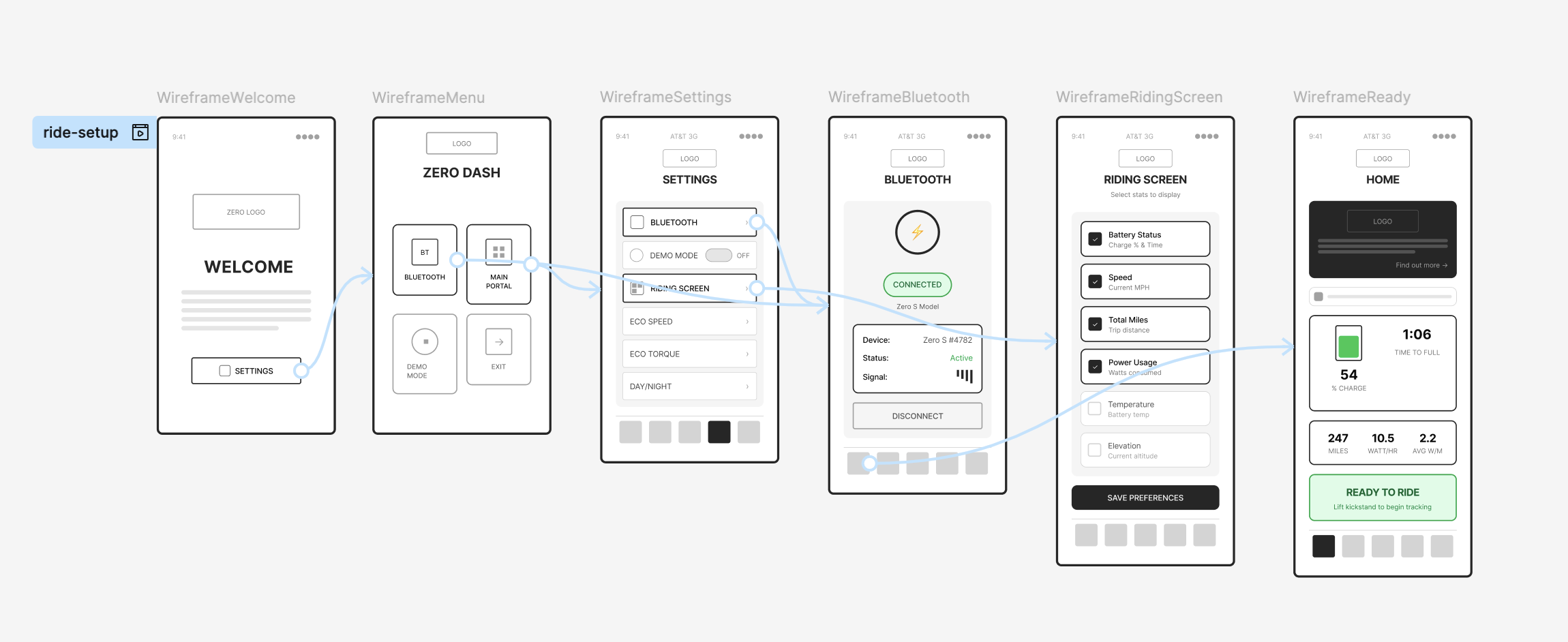
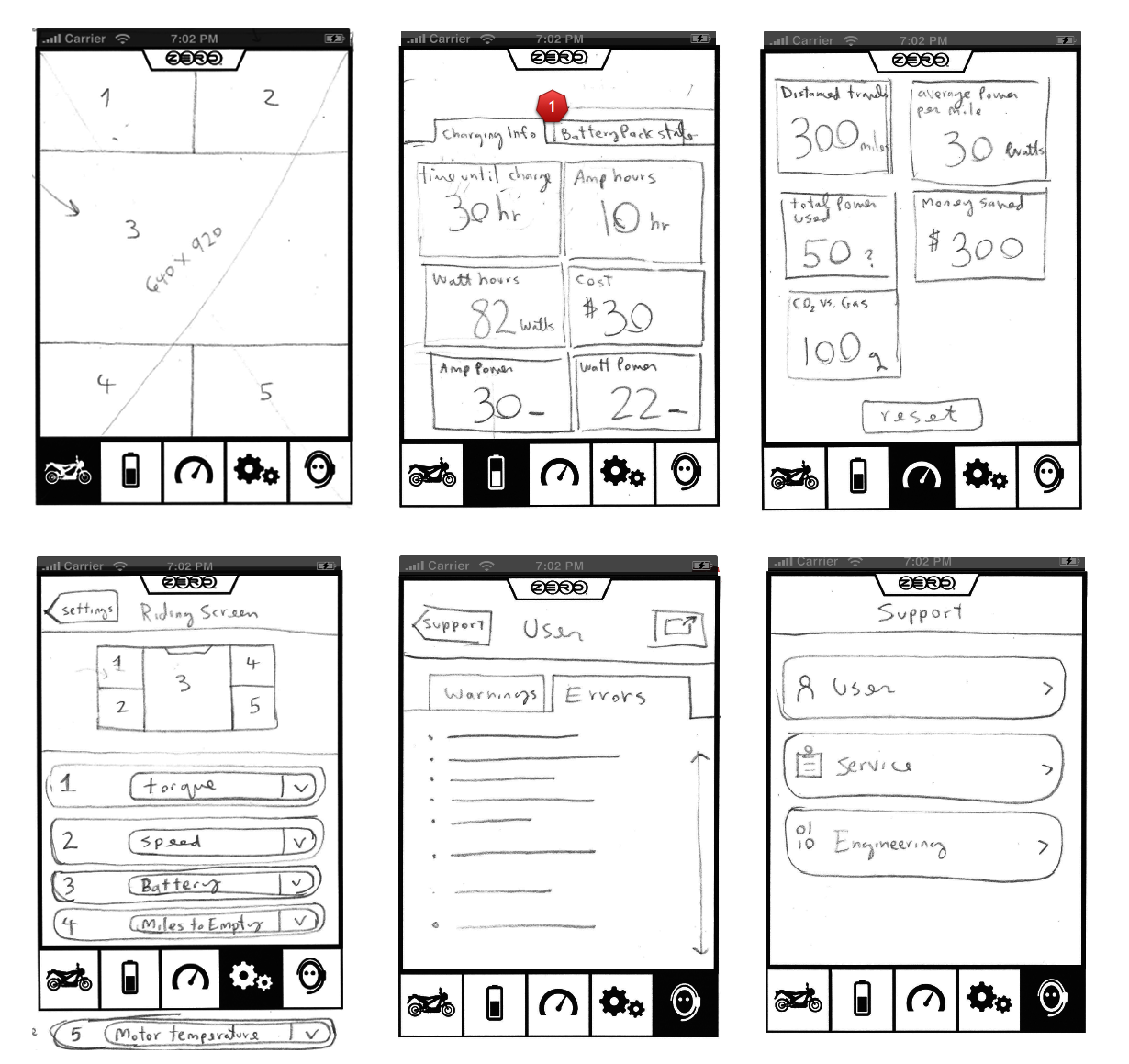
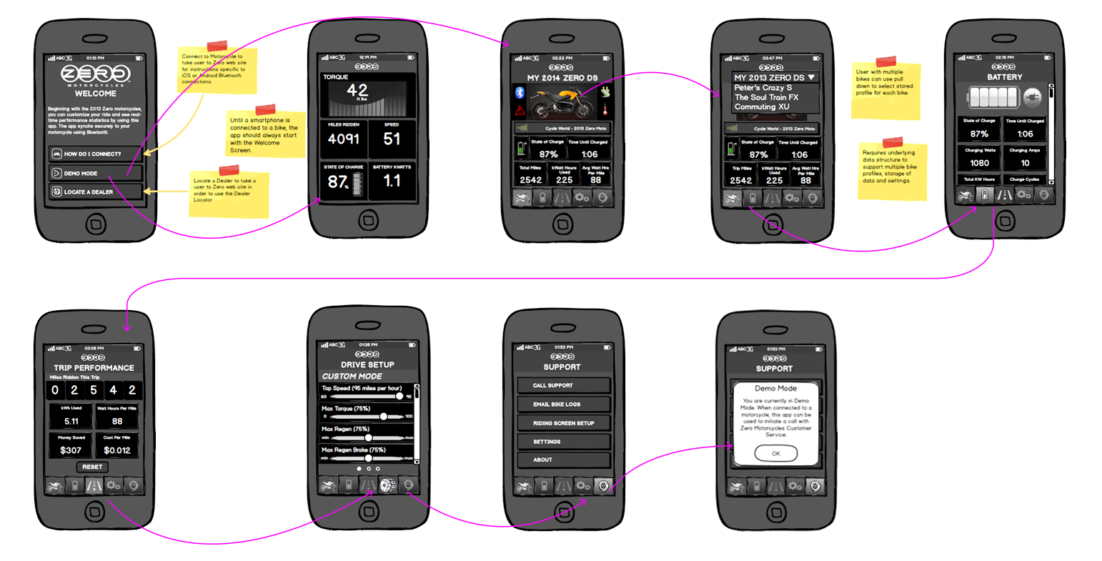
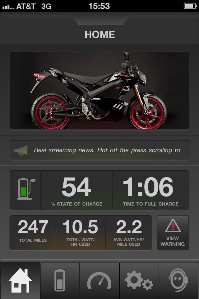
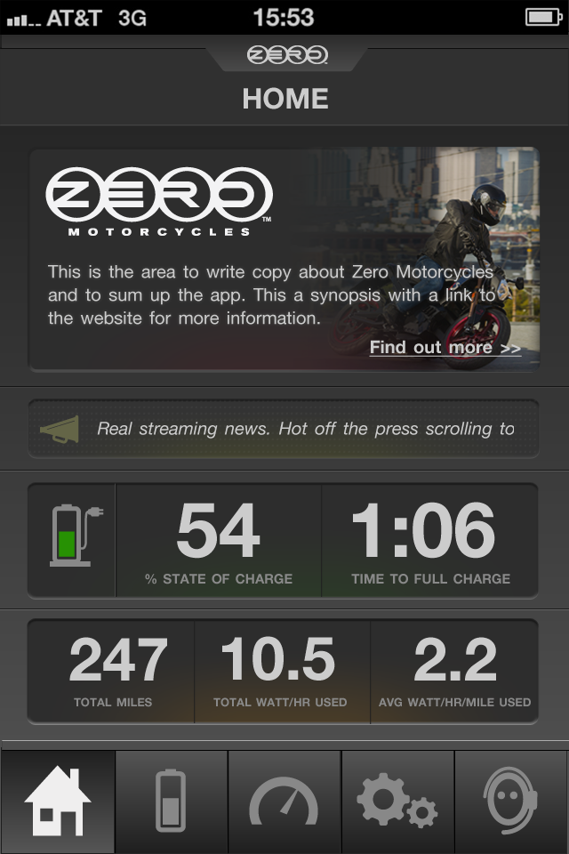
Dashboard & screen iterations
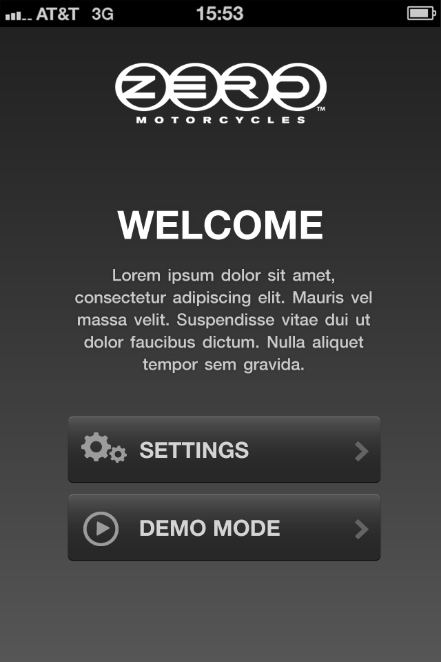
Iteration for the onboarding welcome “Get Started” screen.
Iteration for the onboarding welcome “Get Started” screen.
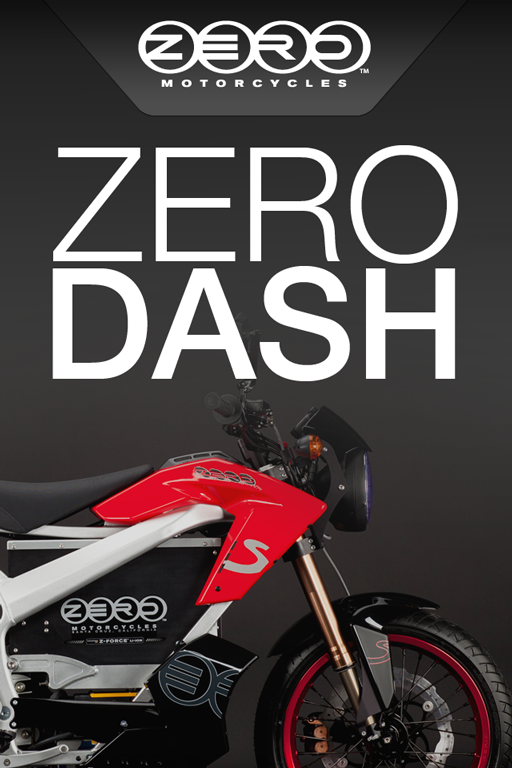
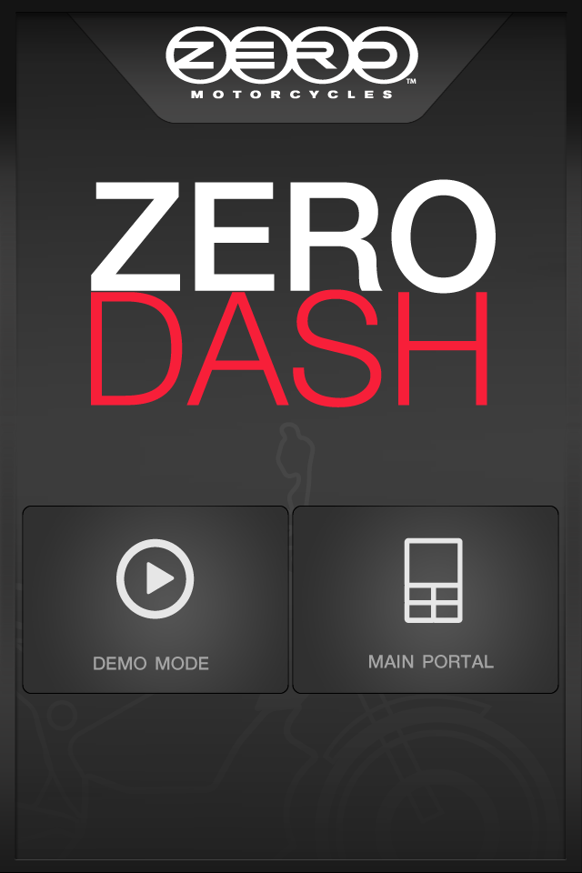
Early iteration for the splash screen.
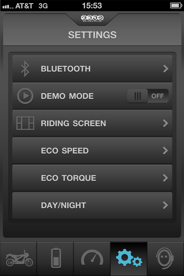
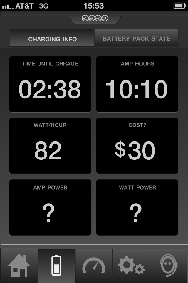
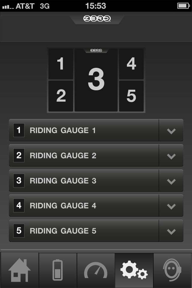
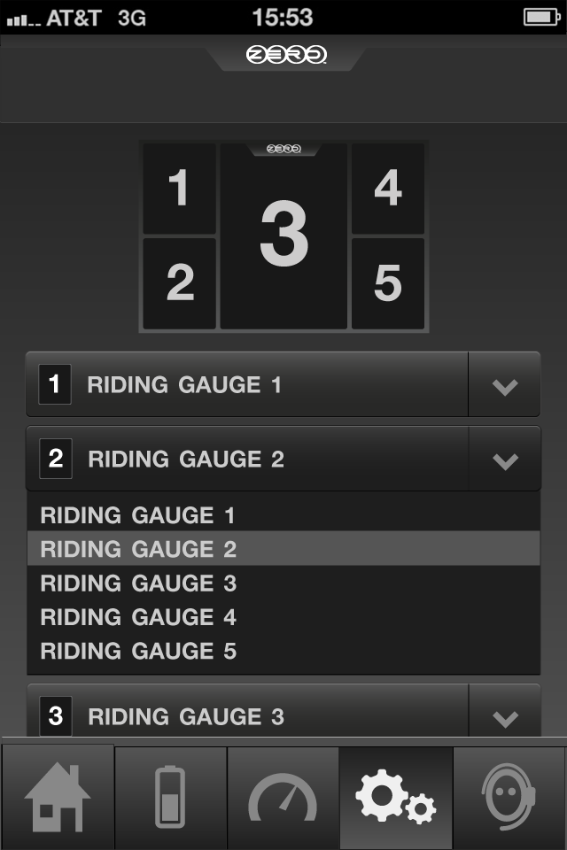
Iteration for the riding gauge settings screen.
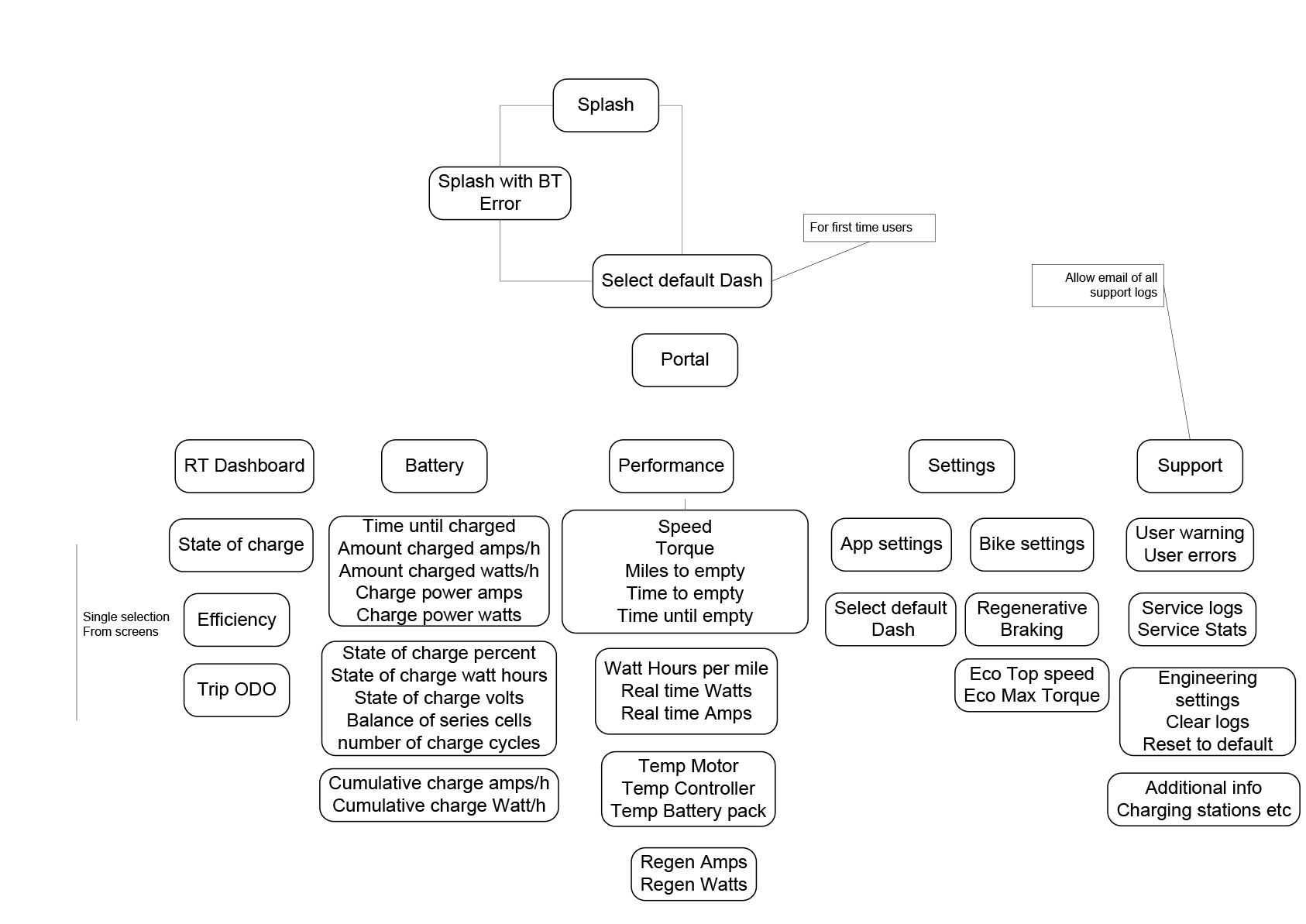
Gauge components
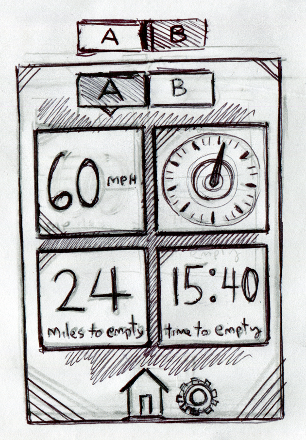
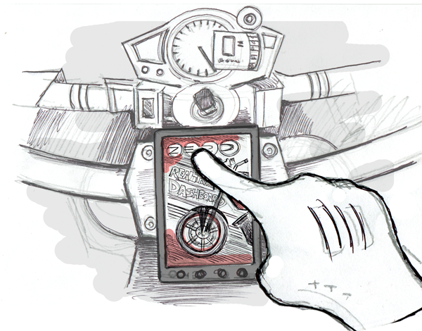
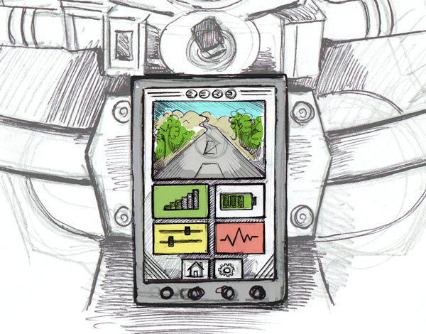
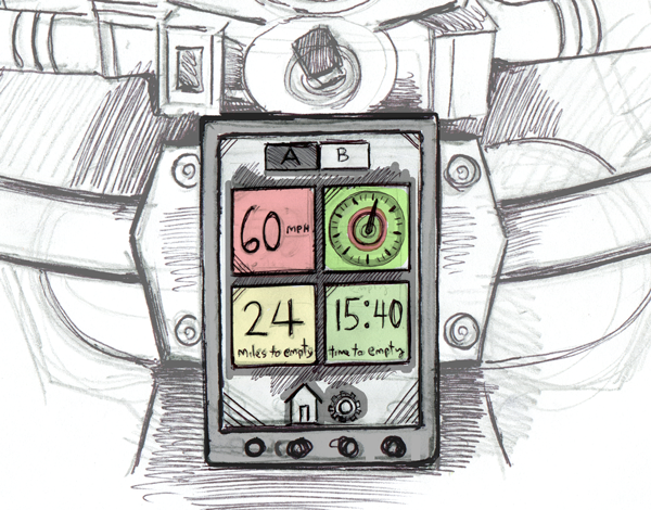
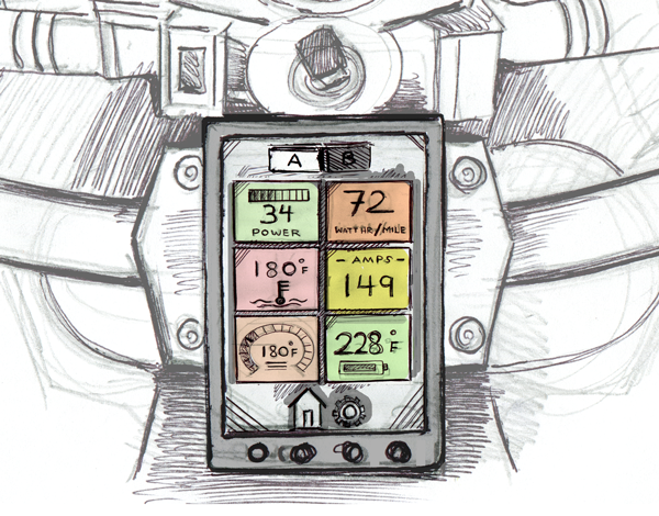
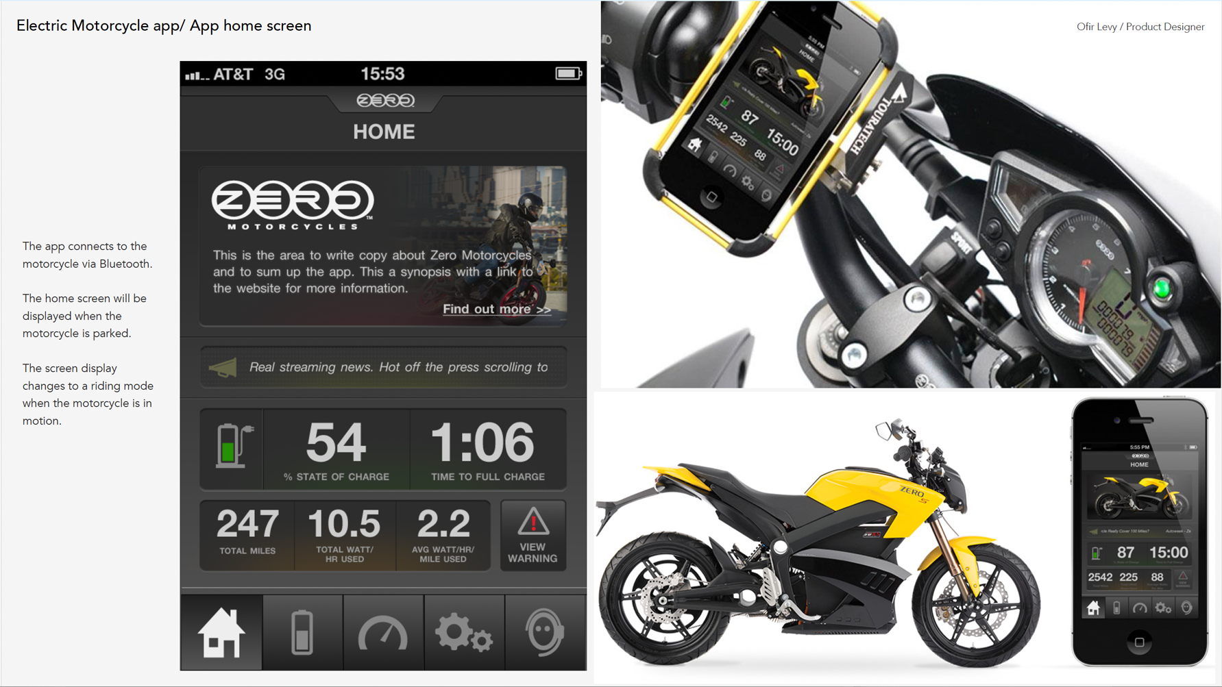
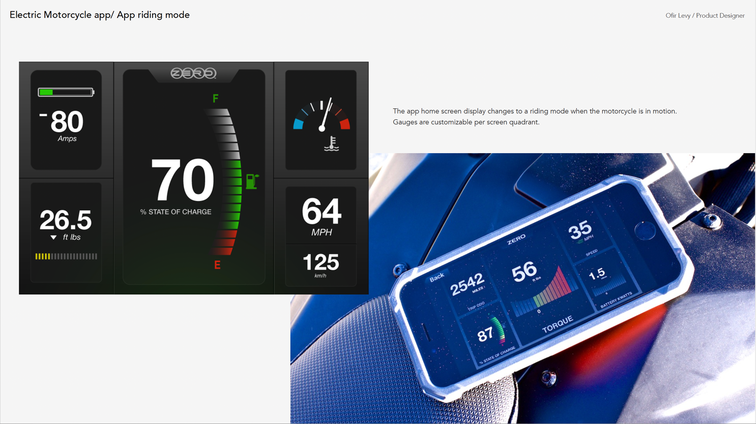
The live riding mode dashboard is divided into 5 gauge areas. Four quadrants surround a central position, with the middle slot serving as the primary gauge — the most prominent and largest display, reserved for whichever metric the rider considers most critical. Each of the remaining four quadrants can be independently configured to show any gauge type the rider chooses. This flexible grid meant no two riders needed an identical dashboard, and the setup could be changed before any ride.
Individual gauge components were designed for each rideable metric, across fill states and data ranges.